Essays by Charles D’Ambrosio.
You should never judge a book by its cover.
But always judge a bookstore by its staff suggestions.
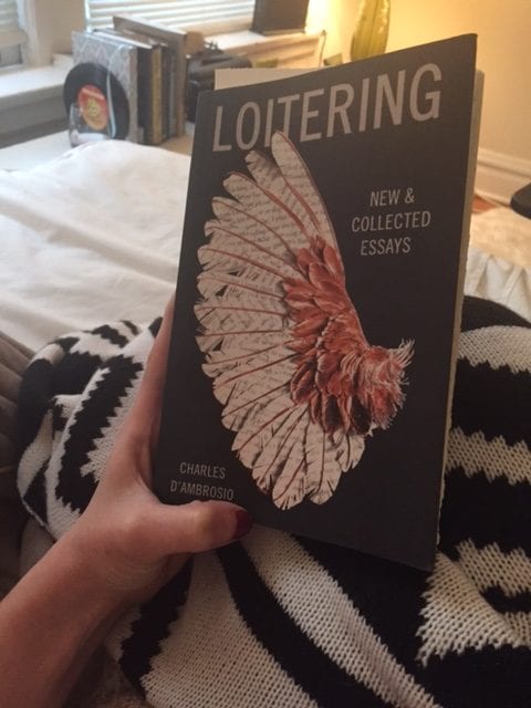
Just a block from my new place in Chicago is a bookstore with an impeccable recommendation section, and I recently picked up writer Charles D’Ambrosio’s book of essays “Loitering” and am smitten with his writing style and ability to build an essay. He’s a modern master of the form who digs on Susan Sontag and Edward Abbey. I love that the title of the book describes what he thinks essays are… loitering. Hanging out around an idea. No conclusion necessary.
I *do* think the book cover is cool. Whatever, Red Bull. Words give you wings. Sometimes they’re broken…
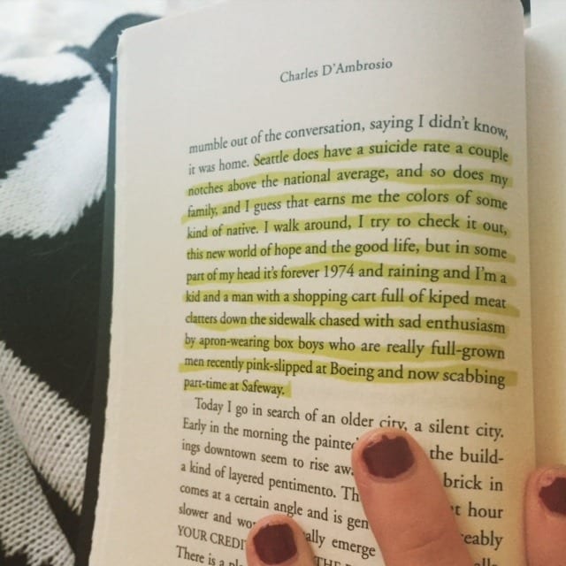
A sampling of his style, for your viewing. Then get your own copy. Mine’s taken.
Damn. That is a sentence.
Advice for writers by way of Andrew Solomon and, of course, Rilke.
This article, which is an oldie but a goodie, speaks for itself, but here’s an excellent taste.
“The worst mistake anyone can make is to perceive anyone else as lesser. The deeper you look into other souls—and writing is primarily an exercise in doing just that—the clearer people’s inherent dignity becomes. … Never forget that the truest luxury is imagination, and that being a writer gives you the leeway to exploit all of the imagination’s curious intricacies, to be what you were, what you are, what you will be, and what everyone else is or was or will be, too.”
I like his thoughts on being an oldie but a goodie oneself. Age isn’t a restriction, and we can learn a lot from one another, young and old.
I also felt this way, though not so thoughtfully, after listening to this NPR article about how Millennials interact with the fantastically conceived Taco Bell brand via social media but they’re still not buying more tacos and as a Millennial I’m just kind of over being a Millennial and I know all of our lives are hard no matter what age we are and we all just want to see horses turn into unicorns and wow that must mean being a Millennial doesn’t really matter anymore because we’re getting old and there is fresh new blood in the water and it smells like tacos and who even am I anymore?

Opening credit art.
Ever since Mad Men’s iconic opening sequence, TV series have been outdoing themselves to turn this pivotal piece of production into an artpiece. (Or they’re just not doing an opening credit sequence, perhaps because they’re intimidated or it just feels right for the series or they’re using it as a defense against encroaching commercial time restraints. “Here’s the director. IMDB the rest of this shit, people.”)
The best (read: my favorite) ones are, like Mad Men, openings that don’t rely on the obvious visual styles and/or references of their corresponding TV show’s subject matter. That could go terribly wrong though, right? Because it could look so obviously like they were trying to make it different from what the subject matter is and in the age of Reddit and message boards and bloggers like me, just a whiff of desperation can take you off the air. But if done well it sets the tone and gets the viewer excited or intrigued every time they see it. Here are two of my new (to me) favorites.
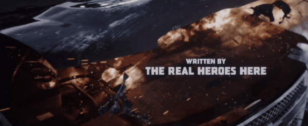
Finally, recent title holder in best opening credits, movie edition = Deadpool. Writers: 1.


