I’m excited to have a new essay and artwork featured in the Spring 2021 editing of IntimaJournal of Narrative Medicine!
My essay, titled Sleep to Dream, is the story of how a recent medical diagnosis has been a surprising, missing plot point for several of my self-narratives.
“Fatigue is my kryptonite. The never-ending scramble for sleep is simply part of who I am. That was the story I told myself, anyway. Then I fell asleep while alone in a late-night Uber ride and finally admitted that slogging through these onslaughts of exhaustion was cause for concern.
That’s why I’m here, trying to make small talk with an uninterested sleep technologist pushing electrodes onto my head…“
I spent most of January in an escapist headspace, burrowing down into several subjects, my fascination with which have taken me by surprise.
1) Richard Yates. I read Revolutionary Road in 2008 when the movie came out because my tween brain imprinted on Titanic-era Kate and Leo in 1997 and I’m pretty much subconsciously committed to following them in a space ship to Mars if they were featured as star-crossed lovers in its alien-infested bowels.
But. I never watched Revolutionary Road the movie for some reason? Probably because I read the book first and it was devastating; too devastating to see on screen right afterward. Fast forward almost 13 years later, the movie’s on HBO Max and with all this quarantine time on my hands, I gave it a crinoline-skirted whirl and… god damn. Devastating, yes indeed, but I was surprised at how differently I thought of the characters and the plot with some years as an adult under my belt. (APRIL, I KNOW, IT SUCKS YOU CAN’T SELF ACTUALIZE BECAUSE OF THINGS OUTSIDE YOUR CONTROL, BUT YOU LUCKY BITCH, JUST ENJOY YOUR HOUSE AND WORK-FREE LIFE OMFG.)
Perhaps my bleak outlook is quarantine related. Or could it be because the movie is different from the book? I bought a three-book tome of Richard Yates’ work and decided to find out. This turned out to be the biggest January 2021 gift of all! What a cynical, destructive, brutal, little worm Revolutionary Road is. 😍 Like the girl-smirking-at-house-fire meme in book form. I love it, and I find such unrepentant catharsis in how slowly but surely Yates dismantles each character with the kind of rage-eyed honesty no one wants to be in front of but, if you see the people the way he does, feels so rewarding and relieving to watch.
And how he does it is startling. Funny almost. You can’t even see it coming. Example: The following savory paragraph about how the children can sleep comfortably now that their parents have stopped fighting (because mom and dad are high on their unrealistic self-deluded fantasy that will eventually kill someone but we’ll get there soon enough!).
“They could lie drowsing now under the sound of kindly voices in the living room, a sound whose intricately rhythmic rise and fall would slowly turn into the shape of their dreams. And if they came awake later to turn over and reach with their toes for new cool places in the sheets, they knew the sound would still be there—one voice very deep and the other soft and pretty, talking and talking, as substantial and soothing as a blue range of mountains seen from far away.”
Then, next paragraph, like a slap in the face from a surly sugar plum fairy:
“This whole country’s rotten with sentimentality,” Frank said one night…
HA!
2) Dennis Rodman. I know, girl! I don’t know! Whyyy?
This minor obsession was inspired by another thing we finally watched: The Last Dance docu-series, which chronicles the 1990s Chicago Bulls as they went for their sixth and final title. At first I was really grooving on Scottie Pippen, learning about his playing style, often relegated to the second paragraph (rightfully so) behind Michael Jordan (GOAT). Then I met Dennis “The Worm” Rodman. Like, basketball Dennis Rodman. I’m so compelled by him! I’m trying to figure out why? I love the way he played basketball, I know that much. Gutter ball go-getter, beast hunter of the rankest of rebounds, trash-talking trash man king of the trash can people…
3) Art as self-authorization. That both of the angry, broken-hearted people listed above struggled with addiction issues all their lives, is the only thing not surprising to me.
I’m interested in people who have channeled extraordinary pain into something else and then turned that “something else” into a brand new something else. Something only they could do or make or be. And if it’s got a little dash of rebellious, self-supporting stank on it, even better. Dennis Rodman became his own performance art piece on the basketball court after accepting that the love/loyalty he thought existed in the world did not, in fact, exist; turning into Dennis Rodman as we now know and (I) love him was the alternative to suicide. For Yates, writing about loneliness, hopelessness, and self-dishonesty the way he did throbs with recognition; this is someone who lived most of their life feeling like a balloon within a balloon, disconnected from others and bumbling about in the void.
Maybe what’s appealing to me about Yates and Rodman right now relates to the third thing I thought about a lot this past month: the idea that being an artist is simply a matter of self-authorization—authorizing yourself to see what you see and express it however you see fit, then move on. I dig that. Feel inspired by it. Even when it comes from deeply flawed sources. Especially when it comes from deeply flawed sources (who have tried and failed to redeem themselves over and over). For those artists I am “rotten with sentimentality.”
Related: Below are some videos I made for my gallery’s Instagram stories this month. I ~authorized~ myself to learn how to animate my work and post it even if I don’t think it’s perfect yet. Can’t wait to see what February brings. Stay healthy, friends.
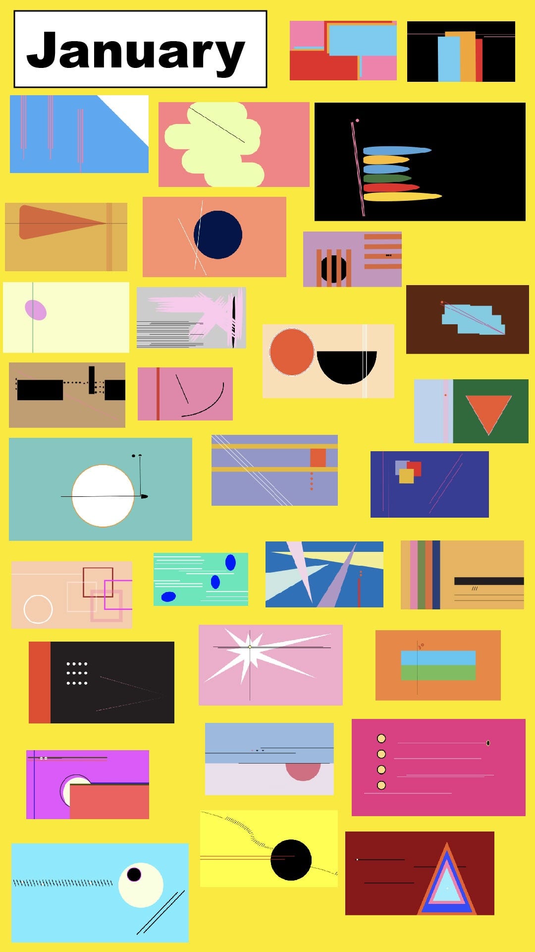
The day after Christmas 2019, I jumped into the Adobe deep end and purchased a year’s-long subscription to Illustrator. I was eager to learn the program, though I can’t remember why? Less expensive than buying canvas and paint, maybe?
Regardless, it turned out to be the best investment of 2019 (and we bought a French press that year!). Making an artwork every morning proved to be an anchor of consistency in a chaotic 2020, a way to visually track my growth in a moment when time started to feel like an unreal flat circle.
And you know what they say: When life gives you time that feels like an unreal flat circle, turn those flat circles into abstract illustrations. Or something.
Three benefits of a daily creative practice:
It breaks down big tasks into bite-sized baby carrots. Doing something daily means you can pick a task that only takes 20 minutes a day and still feel (and be) very accomplished by the end of the week. This makes finishing your Big Project feel mostly carrot, minimal stick.
You learn to trust yourself. I mean, it’s similar to why you teach kids to make their bed every morning. It doesn’t really matter if the bed is made; they are going to just sleep in it again the next night. But it does matter that you learn to trust yourself to do small things in service of your future self. Getting into a made bed at the end of a long day feels so much better than getting into a messy one, right? The self-loving follow-through is what becomes the habit, not the act of the habit itself.
You get better at whatever you’re practicing. And you make some cool ish in the meantime.
In other words, I’ll be back at it in 2021. Cheers, friends. I hope you have the happiest, healthiest new year!
I’m drawn to every version of it. Bubblegum. Neon. Fuchsia. Pepto Bismol. Patent leather (my favorite).
My senior year of high school my mom made me a hot pink crochet blanket as a graduation gift. I loved it. For a while. Then I stored it away in the top of my closet for about a decade. Why? Pink feels authentic to me, but I became embarrassed by my love of the color.
Pink seemed too conventional, too basic, too one-dimensional. That was how I perceived others perceived it. It was as if pink had already been claimed by women who weren’t like me, representing identities of the shopaholic bimbo that I wanted to distance myself from. I felt like pink had been claimed by a consumerist or sexualized society that made me feel less than valuable.
By my mid-college life I had veered away from pink’s statements, shamed by how the color has been weaponized to sell women shit and commodified to represent a whole community (i.e., who should like it and who shouldn’t). I was also cowed by the seeming conventionally of it (this, my own confused internalization of the weaponization of the color), and instead dabbled for a bit in punk rock black or wannabe-queer camo. Color and pattern are so tied to identity in that way.
Eventually, as I settled into myself, I came back around to pink, and I think it’s no coincidence that I fully embraced its powerful hold on me in my 30s, an age profound in its allowance to let me be myself. My true self. My awash in pink, sadly joyful selfhood.
Pink is a symbol of my roots, my discontent, and my self actualization.
I love when men wear or like pink, but I am not too interested in using the color as an obvious gender statement in my artwork, though it probably can’t be unthreaded from that experience in a small capacity. No, I use it in my artwork as a reclamation of the color individually. Pink is powerful. I don’t find it feminine necessarily, but I myself am feminine and find power in being feminine—and power in accepting my femininity.
As an artistic element, pink makes anything and everything pop. Pink is a bold choice. It draws your eye and doesn’t let you go. I like that it’s still a bit divisive. It is the most stereotyped hue, as far as non-bodily pigment is concerned.
Pink draws attention to itself. Pink makes you look. Pink says, “I am not what you think I am… even though you are looking at me because you think you know precisely what you think I am.”
Pink in an artwork makes you confront something inside yourself.
That something could be big or small, upsetting or comforting. Doesn’t matter. The confrontation is what’s important. A confrontation is a question that makes you pause. It can be as small as a stitch, or as big as an elephant. A confrontation is a question that you’ll answer almost immediately with your intuition. That’s what I’m interested in. The naturalness, primality, invoked by such an unnatural color.
Pink is a loaded adjective as much as it is a color. It is something we culturally face everyday so we’re bound to have associations with it.
Pink cloud in sobriety refers to the typically short period of euphoria that some people feel soon after quitting their drug of choice.
Pink tax is the term for how women are nickel and dimed on toiletry products made for their gender.
Pink line(s), one or two depending on your situation, is what we look for on pregnancy tests as the minutes tick by.
Can’t we just like something? Sure, but what we like has connotations, meanings, and layers. I don’t judge these. Just find it interesting. When we confront our connotations, meanings, and layers as individuals and as a whole, nonjudgmentally, we are closer to making change.
In the path from girlhood to adolescence to adulthood, the color identity shifts along with one’s self and understanding of their persona and place in the world.
Assumptions can be made. Let them.
What we like can change. Let it.
Who we are can change. Let’s.
The color though. The color never changes. And maybe that’s it. Maybe pink is some form of—some outlet for—controlling the narrative of my own life. Seeing my self, my life, my color for what it truly is: Whatever I make of it.
And I want to make it beautiful, fun. I want to make it pop.
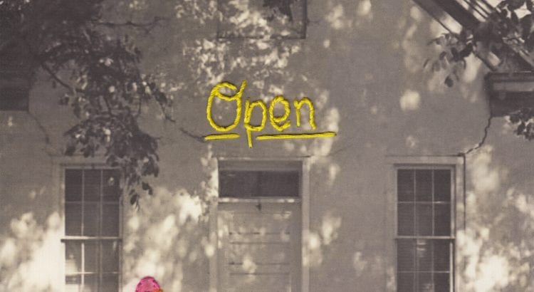
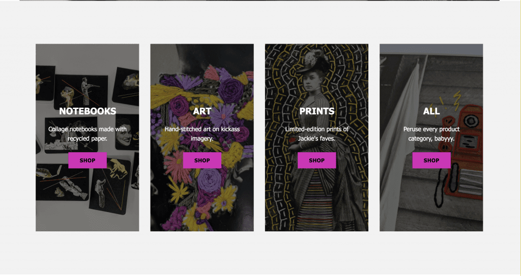
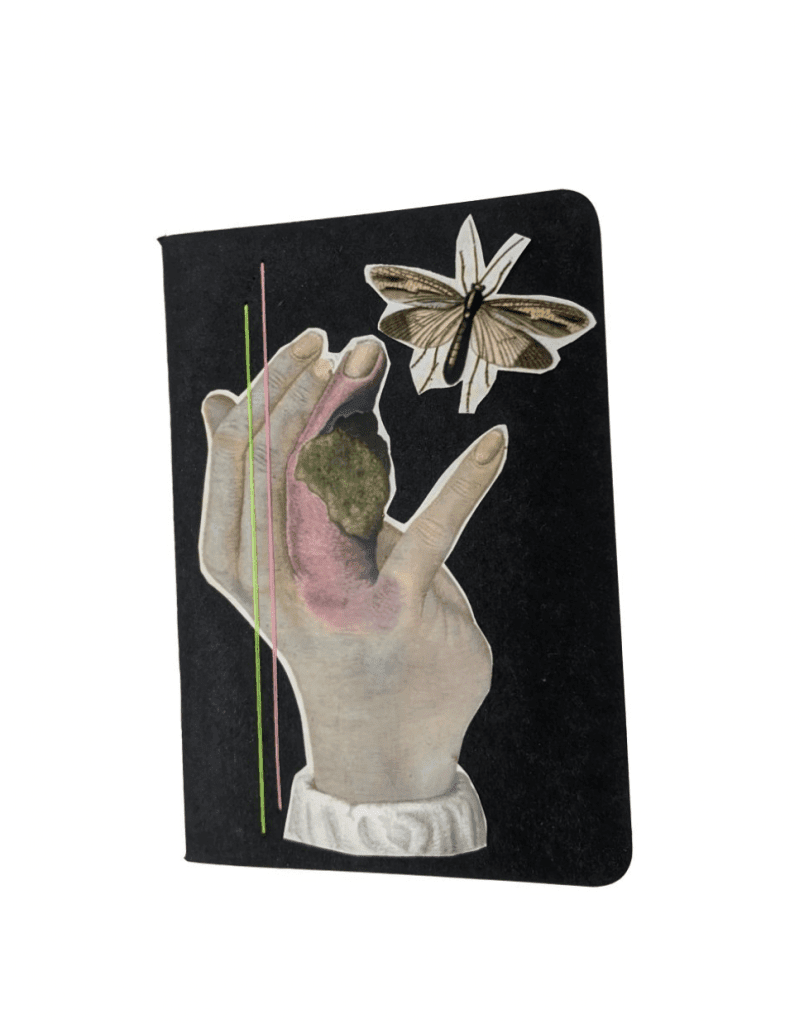
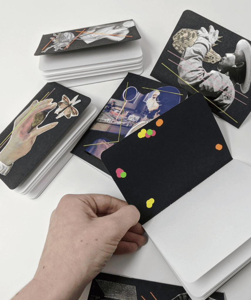
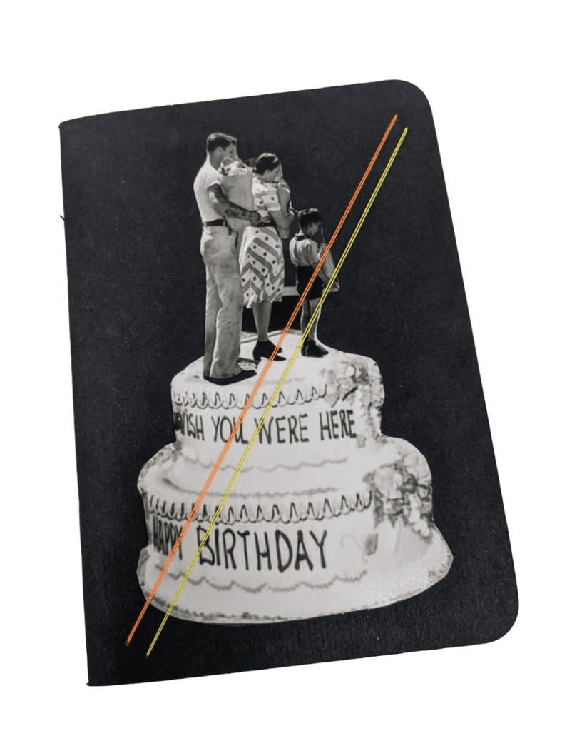
Weeee! Today’s the day! My shop went live today at noon, and I hope you take a chance to poke around. Up now: original hand-stitched embroidery art, collage notebooks, and limited-edition prints of some of my favorite pieces.
I started building the website in April after it became apparent that any art and craft fairs for the spring and summer would probably be canceled because of the pandemic. Little did I know that art and craft fairs for the rest of the year would indeed be canceled too, and my opportunities to share, show, and sell my work at Chicago galleries and storefronts would also be gone with 2020’s germ-infested wind.
A friend of mine recently told me she had heard on a podcast that the best way to mentally get through the pandemic-imposed isolation so many of us are participating in is to do things that accomplish two objectives: novelty and progress. So, for example, cooking new meals (novelty) every Friday from one cookbook (progress). Building this shop has helped me achieve both of those things. The shop is new and, as I plugged away on it with the new spare time on my hands, I slowly progressed the thing from a blank page subdomain into a working shop.
I loved it. The time-consuming, trial-and-error process of building a website reminds me of the meditative work it takes to thread hundreds of stitches into a photograph. This kind of work is endlessly therapeutic for me. I did the design, the building, the inventorying, the anything-and-everything associated with the site all by myself on purpose. I wanted to own the whole thing so if something went wrong, I had the knowledge of how to fix it—or at least where to start looking for the problem. If that’s not a healthy psychological attempt to give myself a sense of control in 2020, I don’t know what is.
I had to develop my inventorying process, shipping workflow, and branding experience. I used Asana to manage my to-do list, because each step in the development challenged me with new questions big and small. Do I need a Cookies alert? How do I weigh packages? What does the UX look like after someone makes a purchase? Who is cPanel? Why the hell won’t my site load? ~et cetera~ (Shoutout to all my YouTube and Creative Live teachers!)
This, the year of our lord baby Beyonce, has been a doozy. Having a digital space to call my own, structure and design at my own pace, and turn to as an expression of creative optimism for the future, has been, well, essential. A new study released in September by Harvard’s School of Public Health found that an optimistic outlook may be a healthier one: “In a population of relatively young and healthy U.S. Army active-duty soldiers, we found that those who tested highest for optimism at the start of the study had a 22% lower risk of developing hypertension during three-and-a-half years of follow-up than those who scored the lowest.”
I’m certainly not soldier-level stressed, but the study’s findings aren’t surprising to me. Building out the shop has been an exercise in escape as well as positivity. It helped me escape into something productive and it pushed me to consider what my future creative practice would look like. Why build a shop if I don’t believe the future will be good? Why work toward something to share in the future if I don’t believe there will be one? Why share my art if I didn’t believe it was going to continue? The shop has been a lighthouse for me in a dark storm cloud year.
Pushing my practice
The other important benefit I discovered while building this shop is that it has helped put boundaries around my current visual art practice and consider how all of my work fits together under one big umbrella that is me.
I think of clearly defined boundaries/constraints in creative practice similar to bowling with bumper lanes on. It helps.
As I worked on laying out the pages, I had to think about how the shop would connect to this site, which then brought up questions of my content on here. I think of jackiemantey.com as an archive of my creative life, as well as a space to jam on current works-in-progress, but what does that look like when I now have a secondary site I want to drive people to, and how do I shape the experience so that it isn’t burdensome for me or the people who visit my sites?
Other questions this work answered: How do I maximize my time working on my many projects, and how do I do it with intention? Am I an embroiderer or an illustrator or a photographer or a writer? All of the above? I think I’m all of the above, but thinking through all of this forced me to outline a hierarchy of these practices and shape an idea of how I envision them all coming together and growing in my next visual project. This work will be pivotal to my decision-making about what I work on next. It gave me guide rails and helped me define what I want to do with myself and my creativity. That, my friends, comes as a relief to a narcoleptic overachiever with a million and one ideas. It gives me something to refer to when I need to say no to myself and get down tothe doing.
How did I go about all of that behind-the-scenes figuring-out-of-stuff? I journaled the shit out of it! In my professional work, I write about artists, their practices as individuals, and how they have come to find and refine their voice. And, bonus, I write brand guidelines about voice, tone, personality, visual language, and more for companies with seemingly disparate, quickly moving parts. So, I decided to do all of that work I usually do for other people, for myself.
I audited my current work and thought a few years ahead of what my dream life as a maker might look like. I defined my visual language (ie., Why do I use pink so much; what does the color represent for me? Why thread? Why old and found photos? Why do I love those slash marks so much?). I wrote out what I did and, importantly, did not want my work to be for me. I wrote about why I make all of this in the first place. I thought of ideas for how the illustration, embroidery, photography, and writing could merge together long term (a direct result of this particular piece of this exploration: My homepage design, which I made in Illustrator using cut-outs of a photograph of flowers I’d taken during quarantine).
In the final stages leading up to launch, the shop also presented an opportunity to learn and experiment with other modes of making. I watched YouTube videos on how to animate photos in Photoshop, and made a few animated videos to announce the opening on my embroidery Instagram gallery. I’m excited to play with this more!
Whew, OK. There’s a lot here, and I have so much more to tell you, but this will do for now. I feel totally geeked (and, per usual, annoyingly sincere) about how focused I feel now because of putting together something as seemingly basic as a website for my work. The project unlocked a lot of understanding about who I am, why this work is important to me, whether I’m a professional or not, and how it will all evolve in the future. Like they say on the Twitter, “Thank you for coming to my Ted Talk.” Now, go visit my shop.
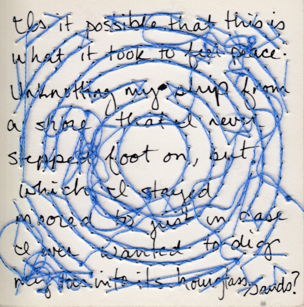
My visual art practice started with embroidery in 2016 because of sobriety, but I think I was particularly drawn to threaded work because I already knew my way around needle and thread. I had learned how to sew as a kid through 4-H projects. My Great Aunt Alice, an incredible seamstress (and elementary school secretary), was my guide. Several weekends every spring, Mom would drive my sister and I out to the other side of the county and drop us off at my aunt’s small brick house. There, we’d cut out our fabric, prep our bobbins, and get to work on the sturdy sewing machine she kept tucked away in her bite-sized kitchen.
I loved hanging out with my Great Aunt Alice—but I hated the work. Sewing is, like, mind-numbingly tedious to a pre-teen/teenager, and I just wanted to play outside! My favorite moments on those sewing sleepover weekends was when the three of us would walk the quarter-mile country lane between Alice’s house and our great grandma’s farm for a visit and a snack. (And that the one time we watched NASCAR at her house, Dale Earnhardt died. I watched the fatal crash while ripping out seams on a jumper, slack jawed and entranced. “Is NASCAR always like this?!” It’s the only car race I’ve ever watched. Weird.)
My bad attitude aside, those formative stitching experiences did teach me, at least, to be confident around needle and thread. So when I hauled my begrudging but hopeful self into a JoAnn Fabrics at age 30, after more than a decade avoiding anything of the sort, it was like finding an old, steady friend. And an old, steady friend was exactly what I needed in early sobriety (and exactly what I needed at the beginning of a visual practice as a writer who thinks she’s “bad at art”). But now it’s four years on. Why is thread still an ideal material for me?
“To admire a piece of hand embroidery is to appreciate time itself.”
Thread makes me slow down and take my time. Now that I’m no longer a jangly bundle of teenage hormones, I appreciate the meditative space of sitting still to work on something for a long period of time. I can’t rush a piece of embroidery without running the risk of ripping the photograph and, thus, wasting time and resources, so it has a practicality to it. However, my appreciation for thread is philosophical and psychological too. Like the Oregon Trail Millennial that I am, I remember life before the internet and recognize that technology has our lives going at an unusually warp speed. It’s the digital wild wild west and it’s cool but also awful and it’s, ultimately, exhausting. The act of pushing a needle through another material is some throwback shit that is simultaneously novel to me.
Working with thread is a physical experience. When I’m working on an embroidery piece,I’m using my fingertips to delicately thread a needle versus, as per 21st-century-usual, steering them toward a screen to unlock or a virtual thumbs up to give. This physicality is a complementary contrast to my writing practice. Writing is physical for one part of my body—my fingers, as I type. But embroidery of even the smallest of stitches requires many movements in one: pulling from my shoulders, a lean back of my spine, an in-breath as I push the needle in, an out-breath as I pull the thread through. And again. I enter a repetitive physical trance that centers me in my body and asks me to stay. To “stay” is an essential physical and emotional skill, and it’s one that embroidery helps me practice on a daily basis.
Thread can’t be saved on a hard drive. A half centimeter flower made of thread can take me half an hour to get right, and there are images I fuck up but keep working on in order to practice certain stitches or colorways. And, gasp, I never share these publicly. (Doing something expressive we enjoy without talking about it on social media is a cultural novelty at this point!) These practice uh-oh pieces are, I think, not unlike the delicate Buddhist sand mandalas that are purposefully swept away (to dust you shall return!) when they’re complete, an act that symbolizes the impermanence of, well, everything (RIP Dale Earnhardt). I can get lost in time while making an embroidery piece. More accurately, time becomes unnecessary, I become present in each moment and in each breath. With thread, I don’t feel that profound, full-body loss of time when I’m writing or designing something on my computer. What a gift!
“It is particularly pleasing for me to see that the language and imagery associated with embroidery is suddenly to be found everywhere in modern life. Words traditionally associated with needlework now permeate digital and scientific language—we talk of email threads, strands of DNA, the web, the new, and now, most satisfying of them all, string theory. An embroiderer will identify immediately with the idea that the universe and its contents are made up of sub-atomic loops and threads. // To admire a piece of hand embroidery is to appreciate time itself—your fingertips can almost touch the hours, days, and weeks embedded in every stitch. I urge the readers of this book to relish the relaxing pace that the medium requires. This pace and the attention to detail needed can be the perfect antidote to the distractions of modern life. The projects presented here will introduce you to core embroidery techniques—nurturing a focus, patience and precision that I hope will be as rewarding to you as the finished pieces themselves.” — Embroidery: A Maker’s Guide
Thread has a universality and timelessness to it that makes it a symbolically valuable material. Another artist once described my inclination to start embroidering as a method for entertaining myself in early sobriety as a symbol of doing the work of recovery—I was “bringing light to the darkness, one tiny needle punch at a time.” I love this analogy, and I’m not alone in using thread to heal and to, quite literally, unite. Thread has been a lifeline for the working class for centuries and every culture and generation has found a way to subvert both its utilitarian one-dimensionality and its aristocratic exclusivity (i.e., embroidered embellishments were once reserved for only the primped and powdered aristocrats) and transform the act of stitching by hand into an art form, a storytelling medium, and a connective lifeline between members of a spoken or unspoken community. It makes sense to me that the AIDS Memorial Quilt was a quilt, for example—that needle and thread were the materials they chose for something so representative of both sides of the coin, the joy and celebration of an individual life, a single stitch, a single breath, the sadness and anger tied to the injustice of not “clothing” these brothers and sisters, etc.
Thread is a demarcation of an expedition, each stitch a breadcrumb on the path. The stitches are small, but their size is disproportionate to their meaning. They hold so much in their strands.
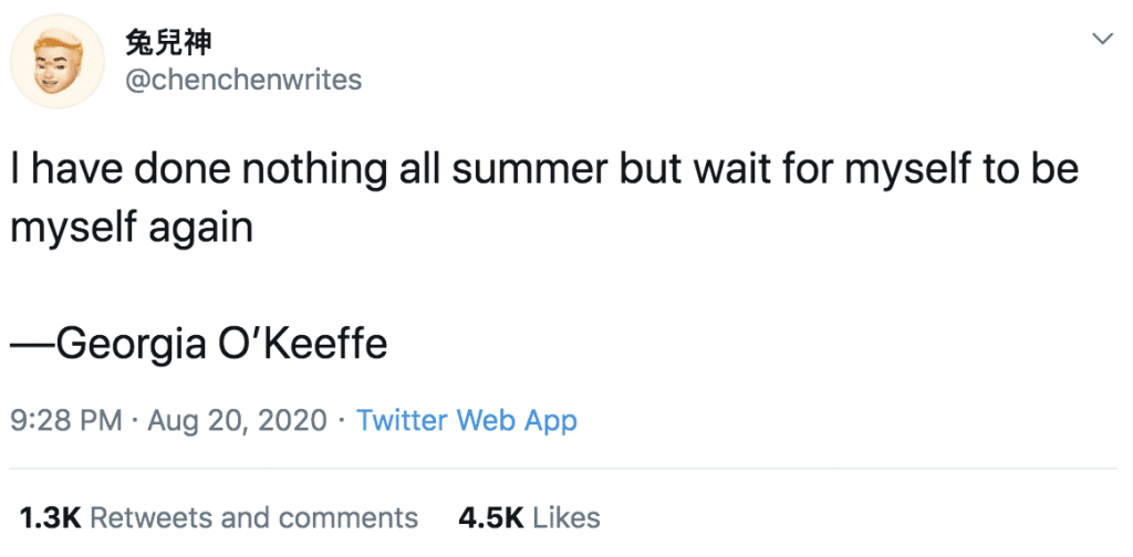
A bunch of poets I follow on Twitter liked this Tweet today, so it magically showed up on my timeline, and it’s perfect:
“I have done nothing all summer but wait for myself to be myself again.”
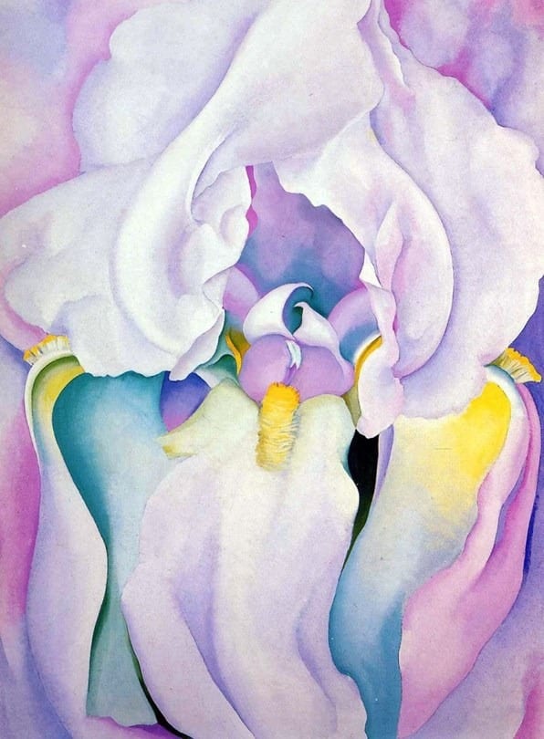
Georgia O’Keefe is famous for her flower paintings that look like, ahem, hoohas. That’s a reductionist distillation of her work, but it’s genpop-accurate because, whatever, we can only maintain so much info in our brains so it’s easier to identify her contributions to the art historical cannon by the most “memorable” thing about her work.
OK, Georgia!
Perhaps, though, with the following passage of her own writing, we can see beyond Georgia’s ~flower vaginas~, and remember why she picked flowers as a focus of some of her paintings in the first place. Because they’re freaking beautiful.
Georgia decided to zoom into the blooms and paint a magnified perspective of flowers after being drawn to a tiny flower in a still life painting by Henri Fantin-Latour.
Here’s what she wrote:
“A flower is relatively small. Everyone has many associations with a flower—the idea of flowers. Still, in a way, nobody sees a flower, really, it is so small—we haven’t time—and to see takes time, like to have a friend takes time. So I said to myself—I’ll paint what I see—what the flower is to me but I’ll paint it big and they’ll be surprised into taking time to look at it. I will make even busy New Yorkers take time to see what I see of flowers.”
That the busy New Yorkers didn’t see flowers, necessarily, and instead mostly saw vaginas (or at least the art history did) is totally predictable and, like, what are we gonna to do? Georgia’s voluptuous flowers have caused celebration for the fornication-fueled folds of the most tender of lady parts, and so be it. Hell yeah. Let us toast the vaginas! Long live the labia! But also, as we cheer, may her idea of magnifying flowers as a means to share with the world what a pause to stop and look at the lilies can do for one’s, well, soul, hold meaning for us as well.
What can you take time to appreciate more closely this weekend? Might I suggest Ram’s Head with Hollyhock? Or your nearest adult, consenting vagina?
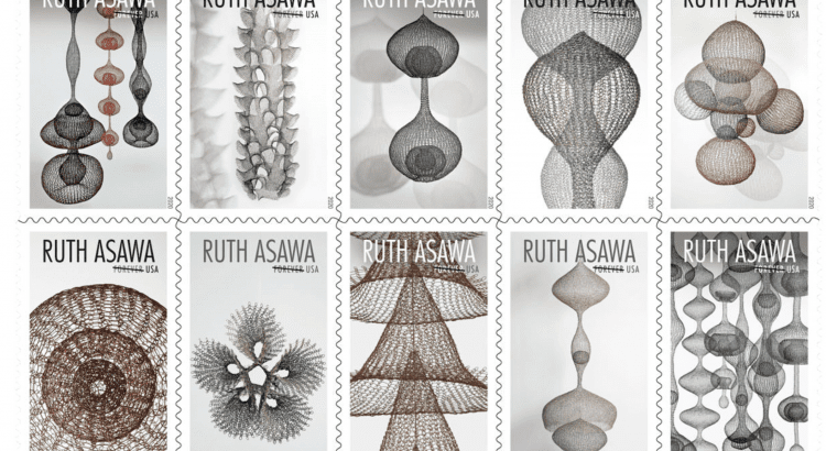
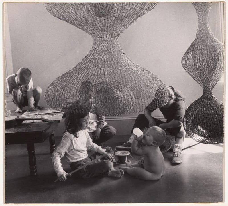
Y’all. Ruth Asawa had six kids. Did you know that?
What an impressive human. To raise even one offspring and have an internationally successful and personally meaningful art practice seems like a near impossible achievement. Actually, having an internationally successful art practice AND/OR personally meaningful art practice child-free seems like a nearly impossible achievement.
Here she is with four of six. FOUR OF SIX.
I learned this fact about Ruth in ^this video promoting new USPS stamps featuring her work, intricate wire sculptures that explore how “the relation between outside and inside was interdependent, integral.”
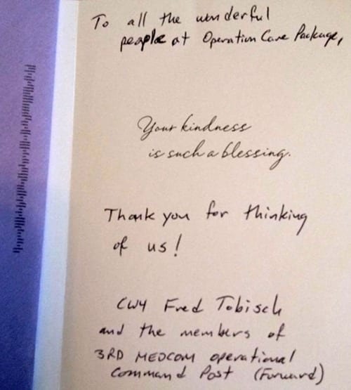
How very relevant in a pandemic that has us all stuck inside and having sweaty pastoral dreams! Also relevant: Stamps, supporting the post office, sending care packages to all the people you miss, etc.
Also, also relevant: The following quote from the USPS video about how Ruth found time to meet her practice, continually pushing her process and forms (all while being, let me just say this one last time, a mom of six, in the mid 20th century).
“Use your little bits of time. Your five minutes here, your 10 minutes there. All those moments begin to add up. … Learn how to use time when it is given to you.”
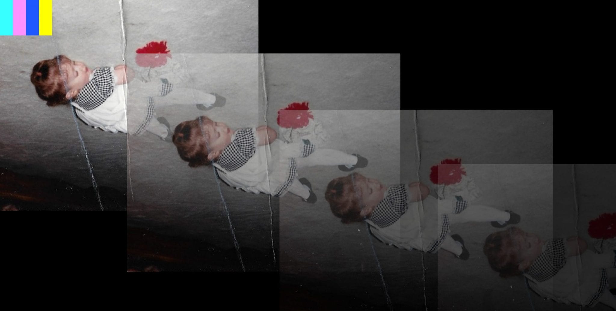
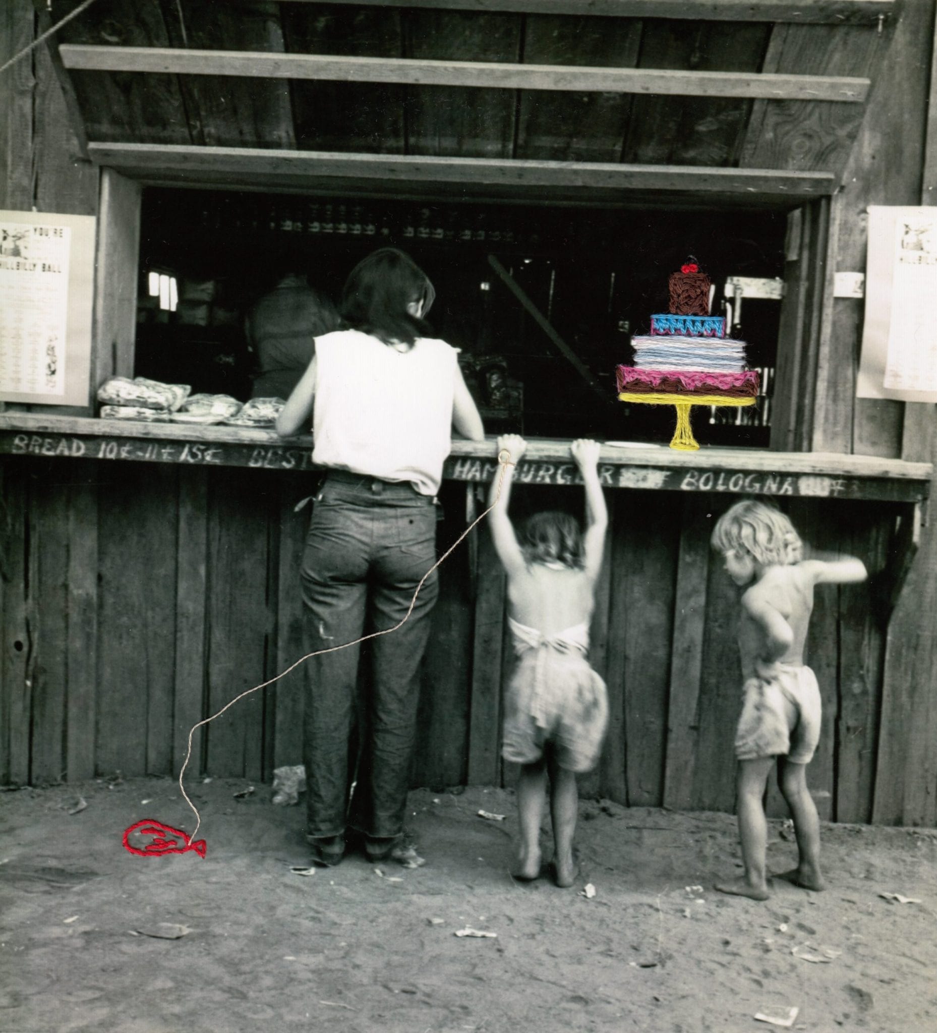
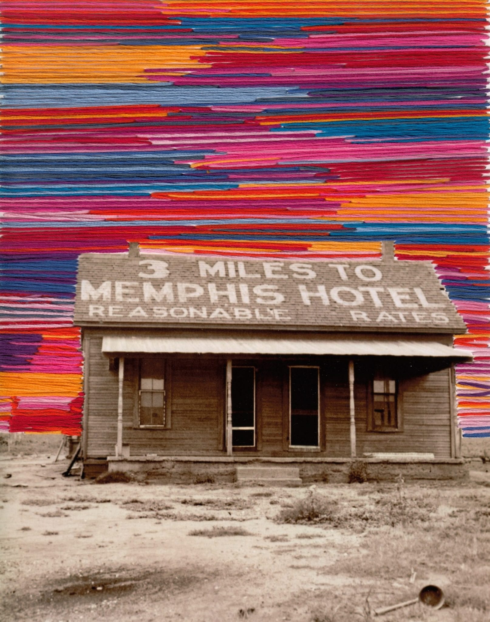
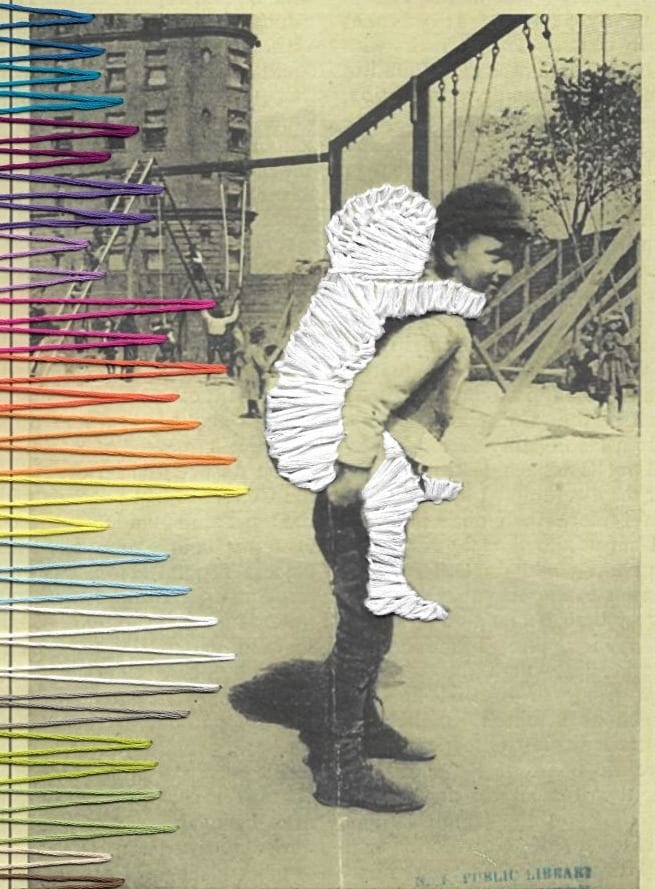
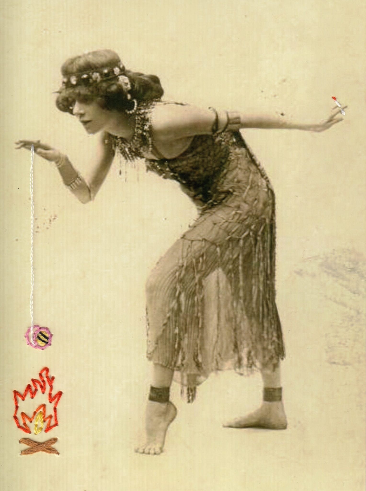
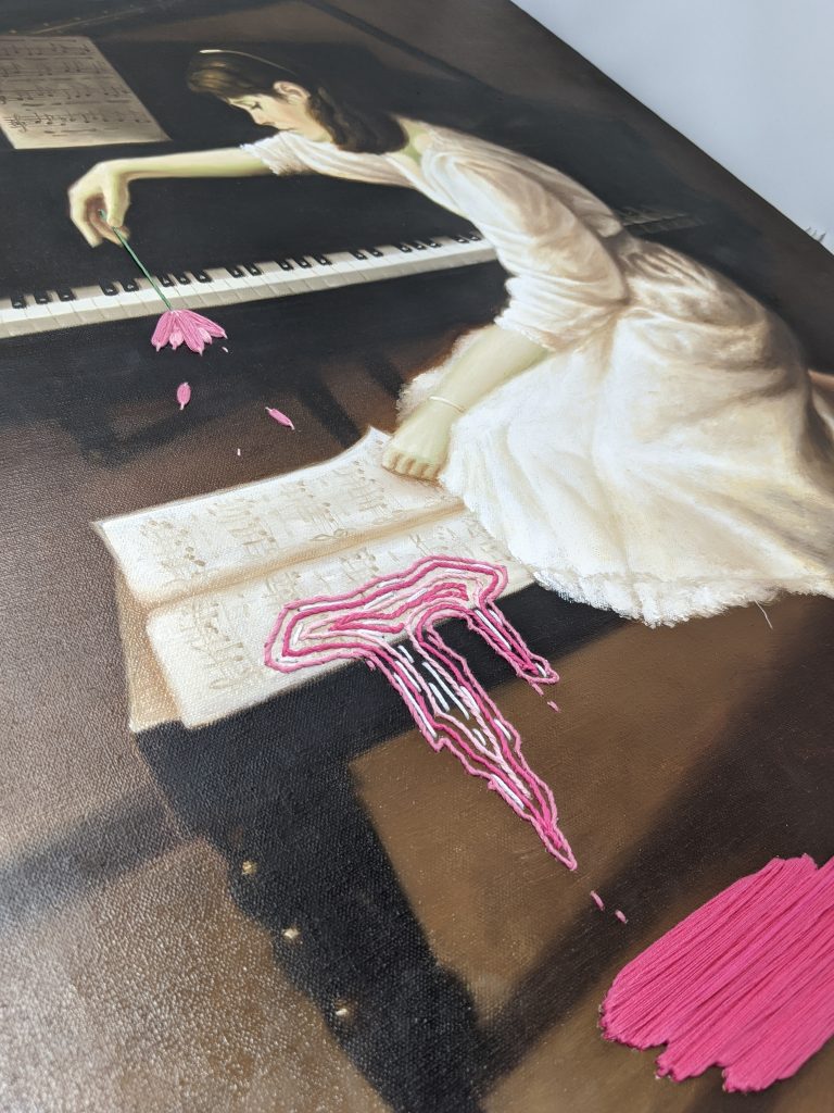
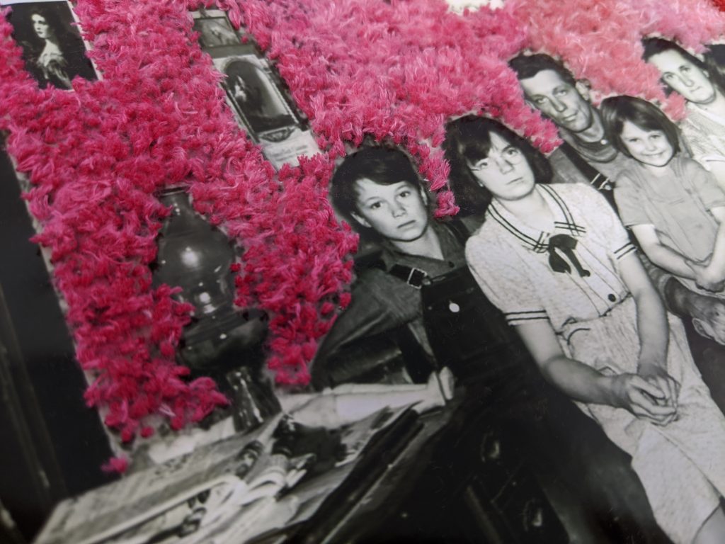
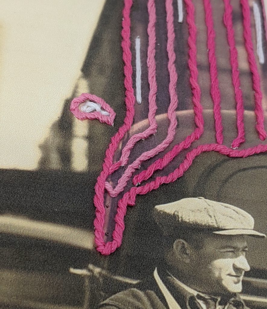
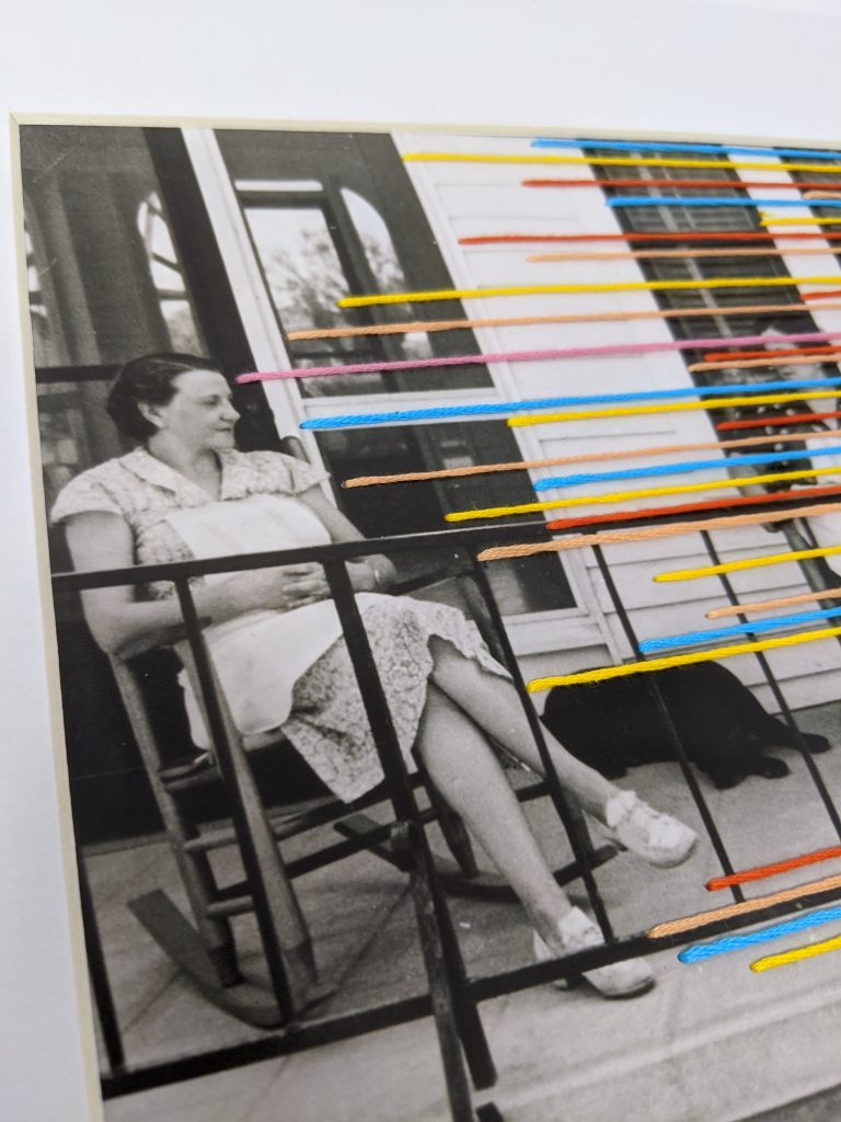
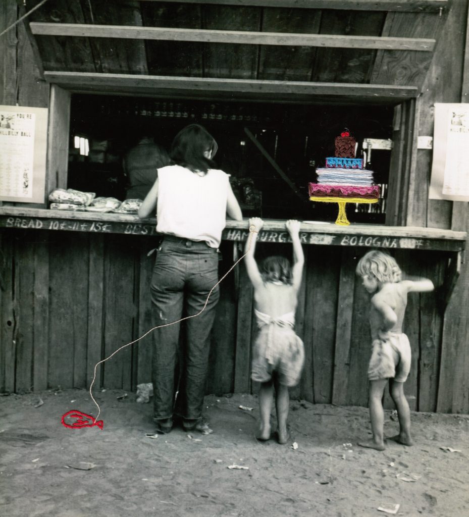
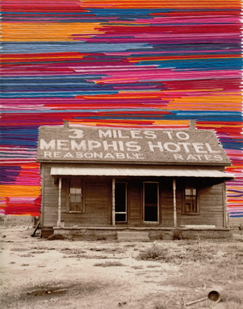
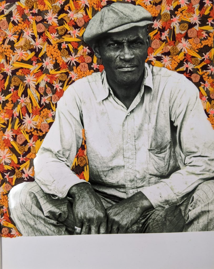
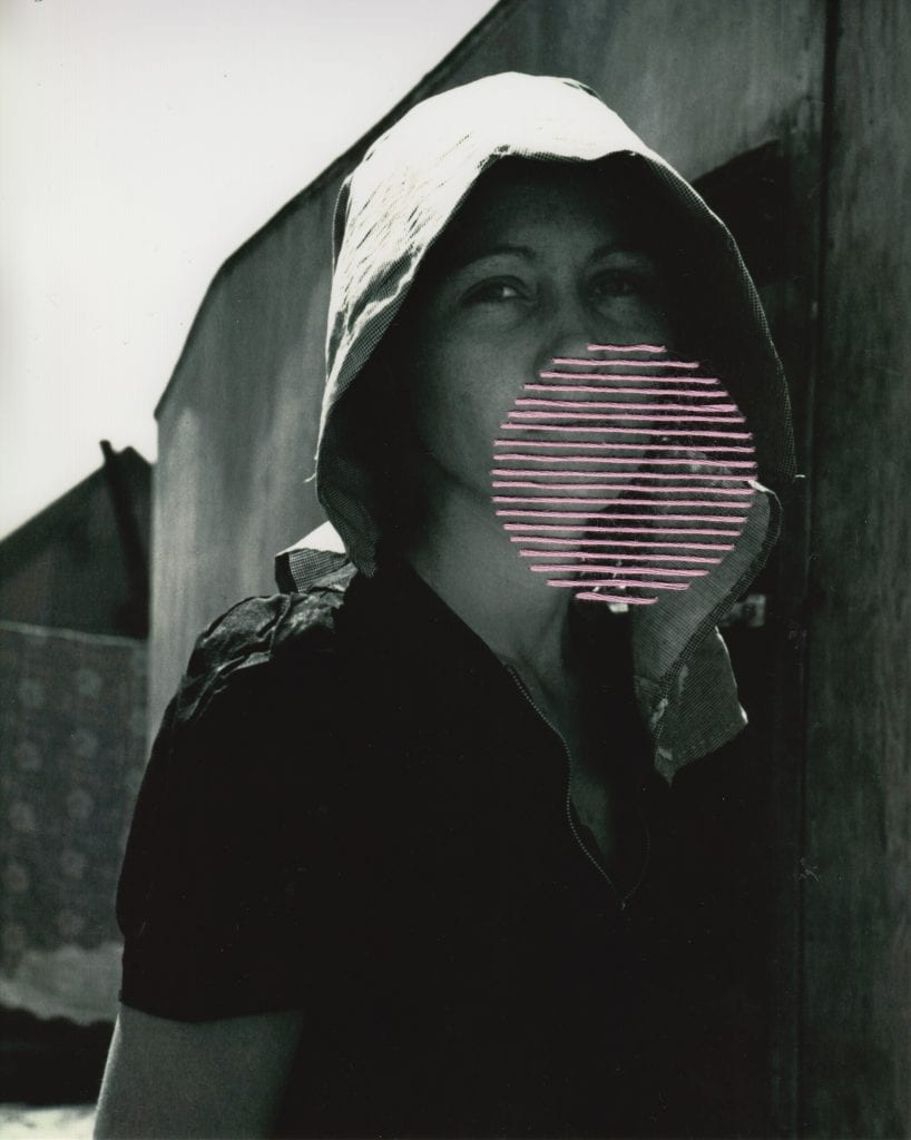
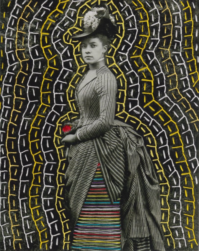
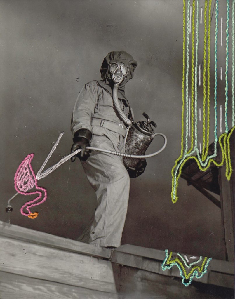
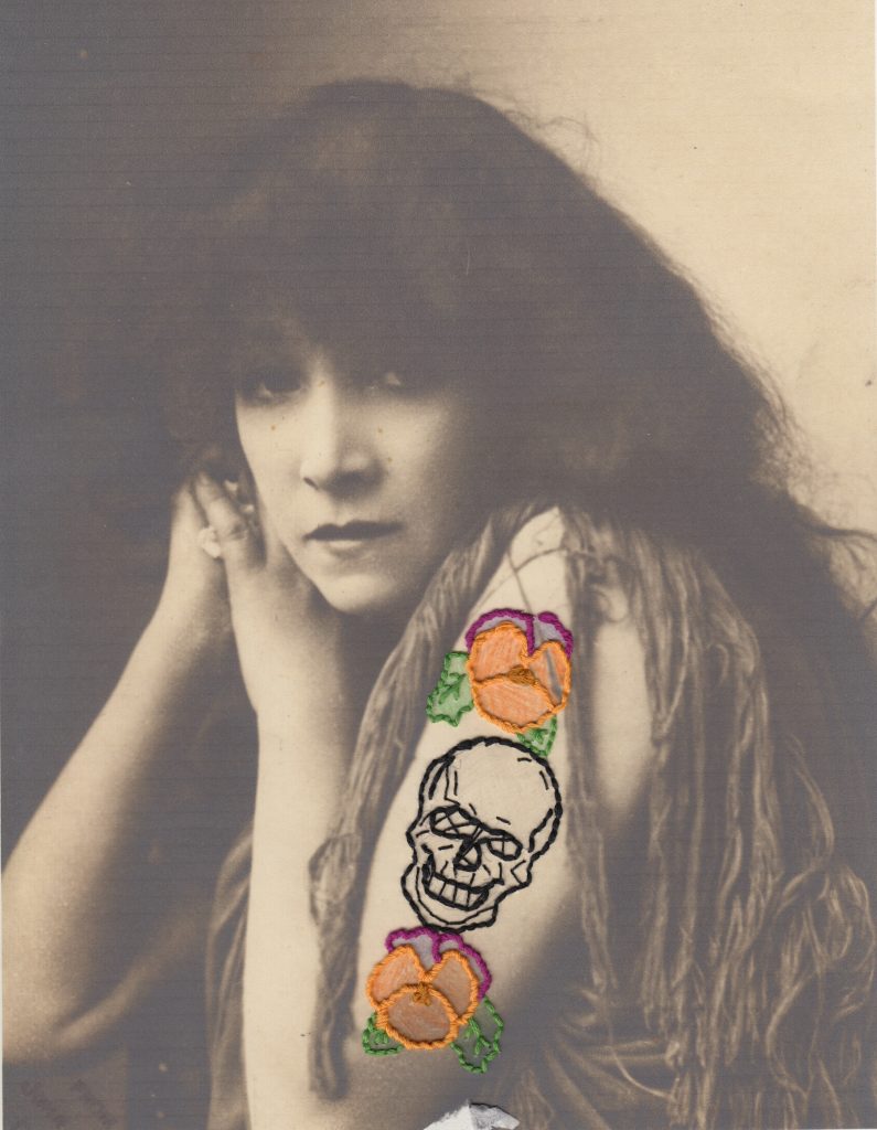
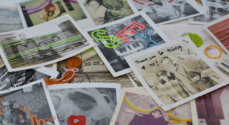
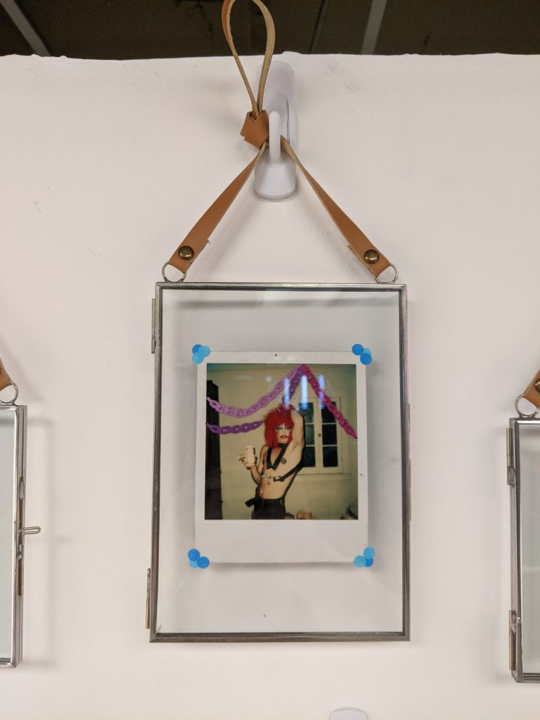
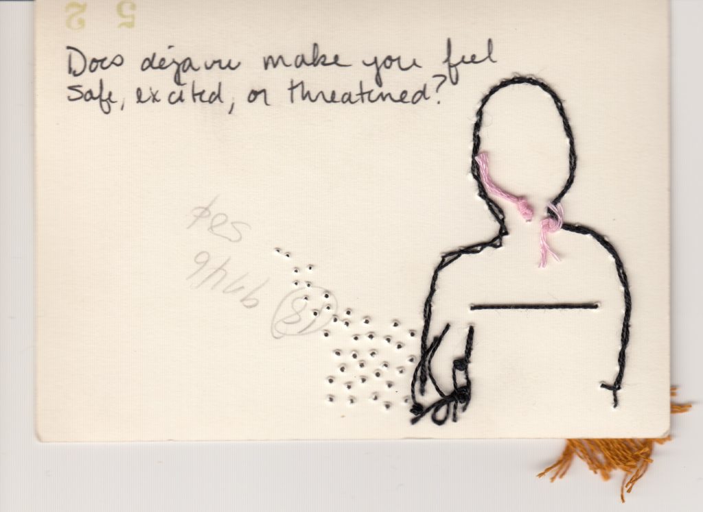
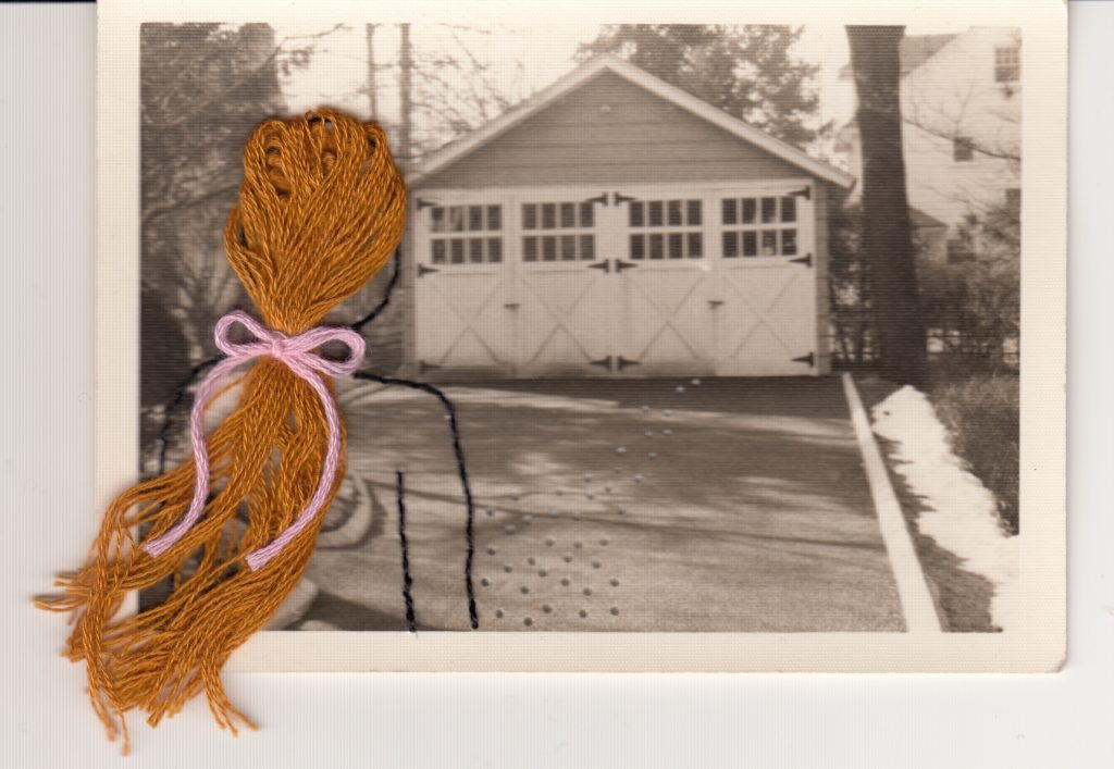
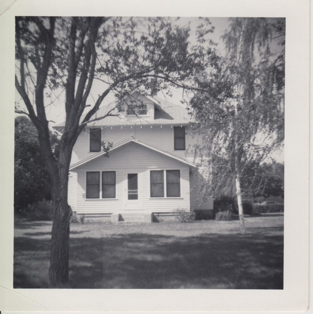
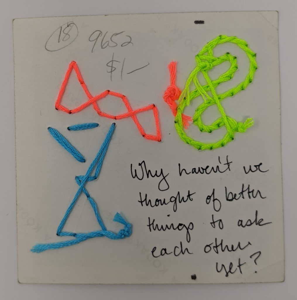
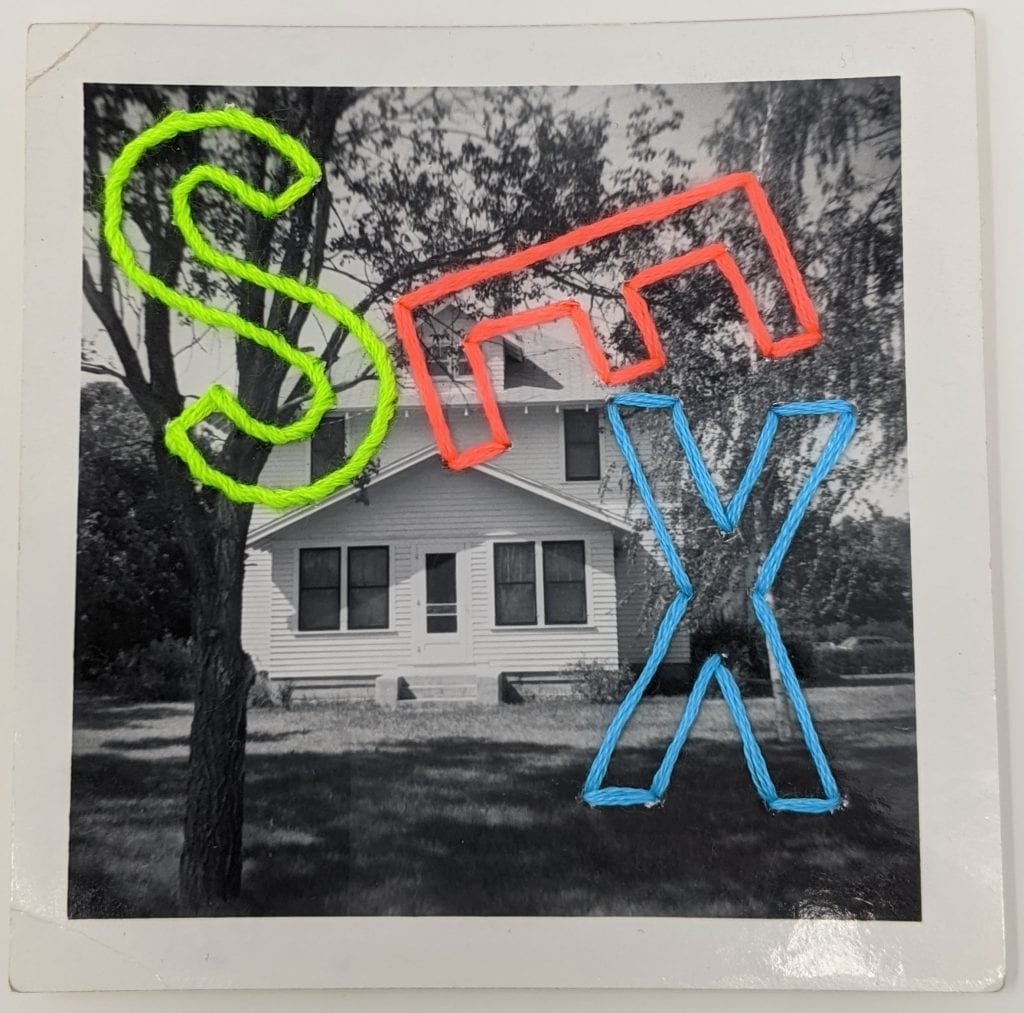
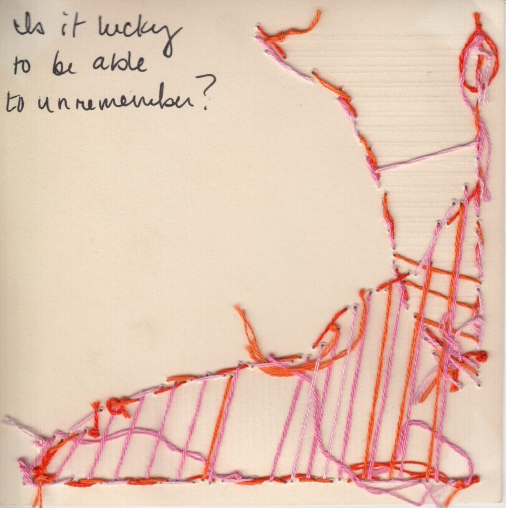
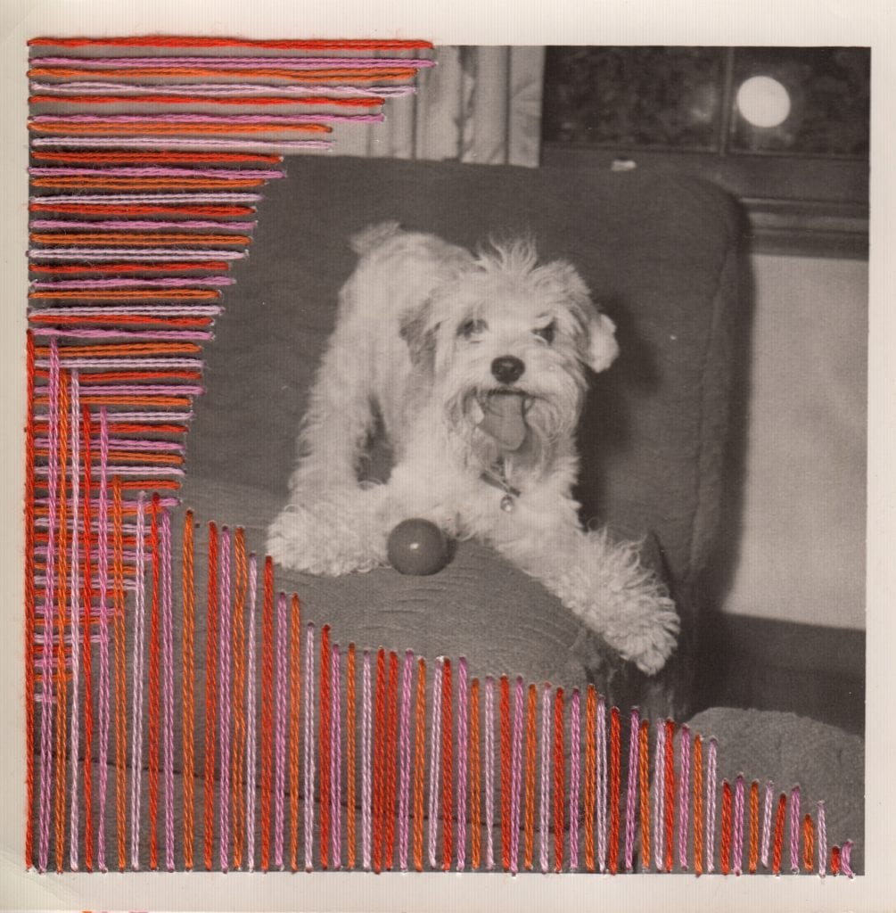
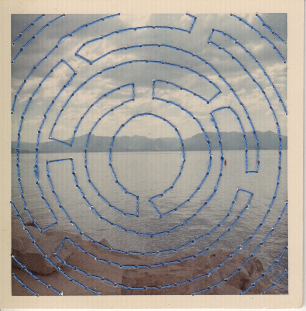
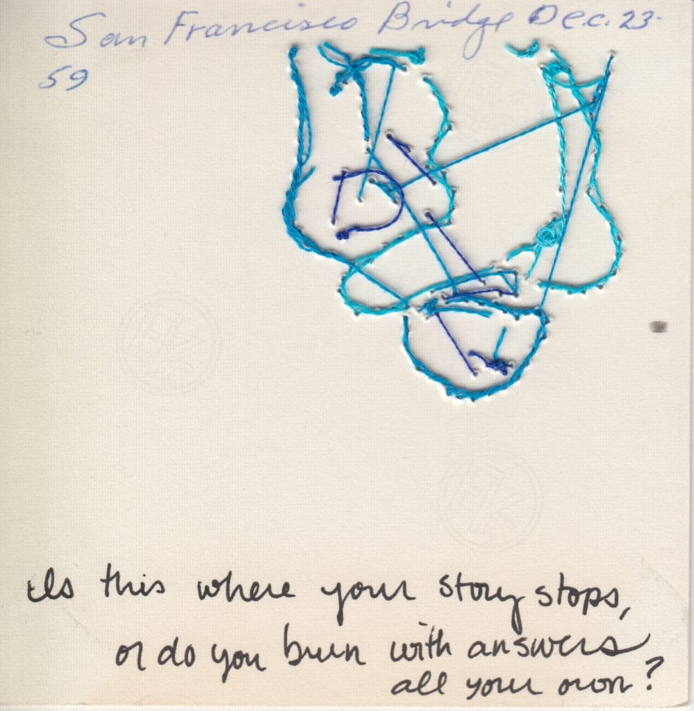
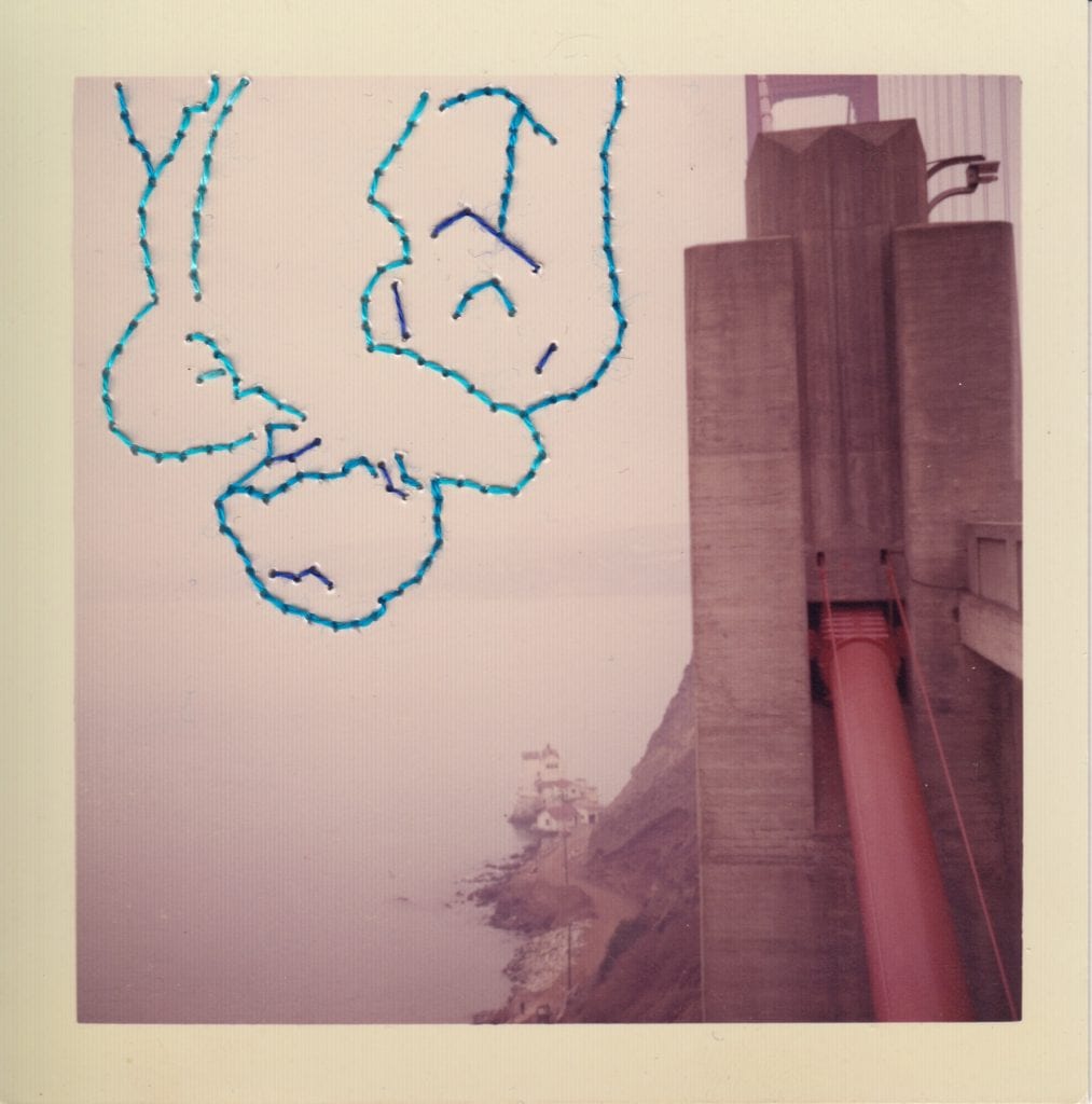
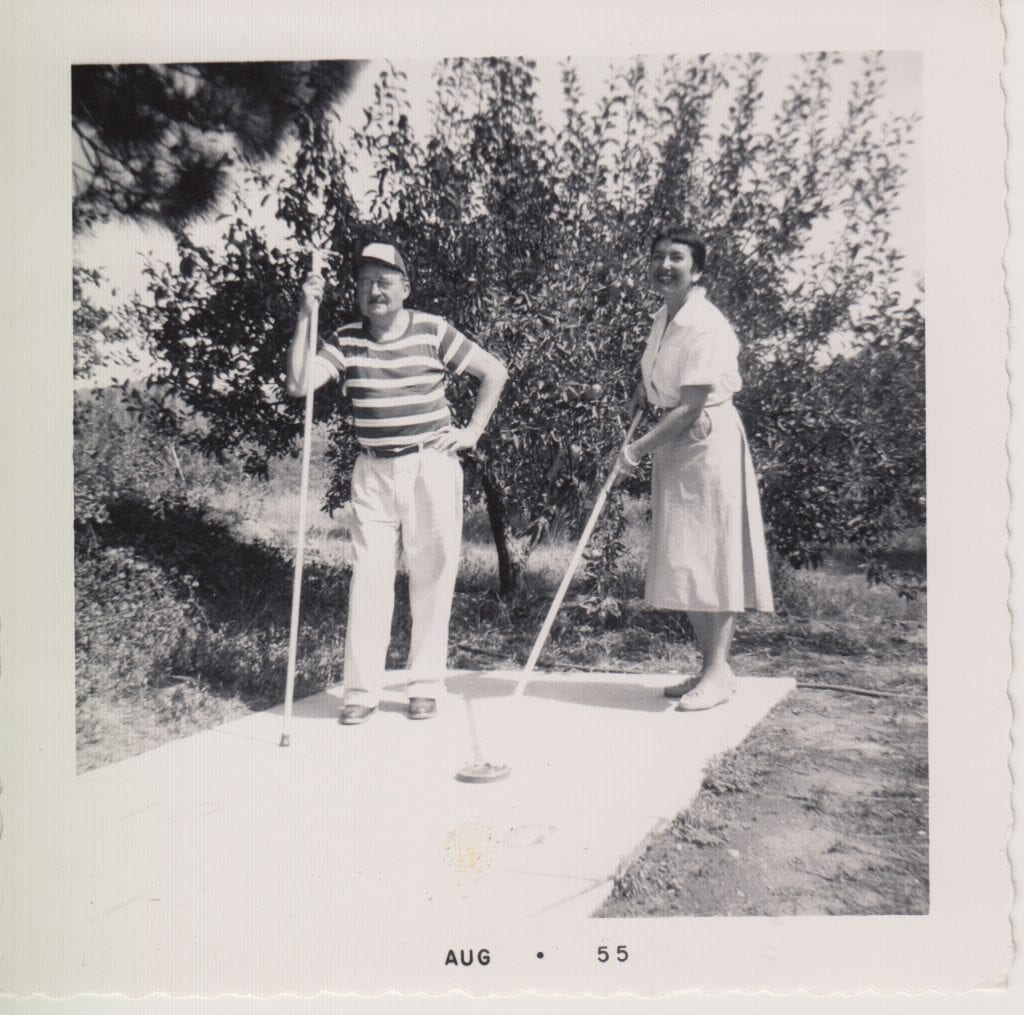
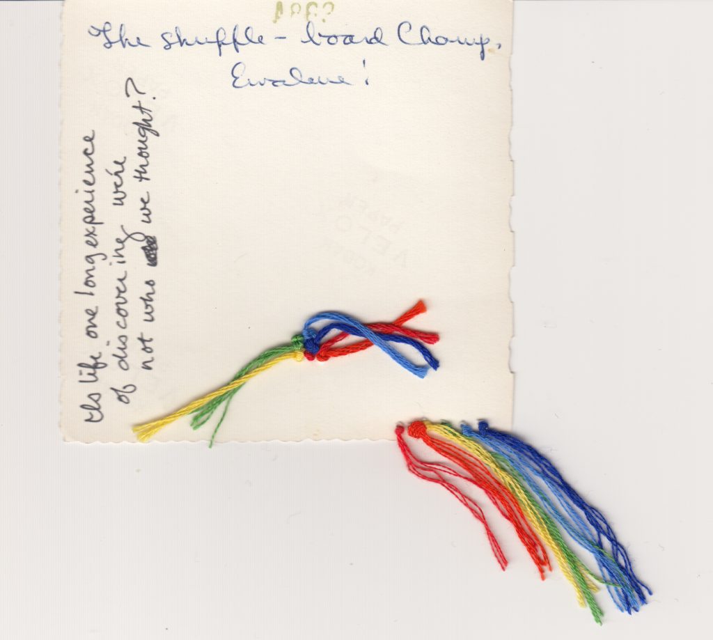
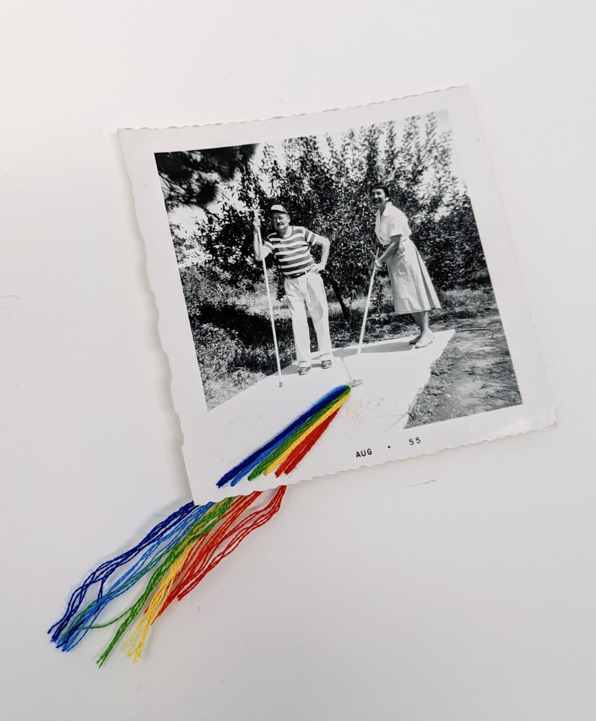
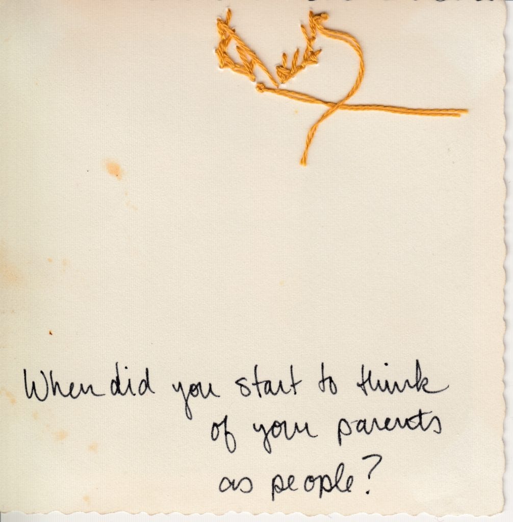
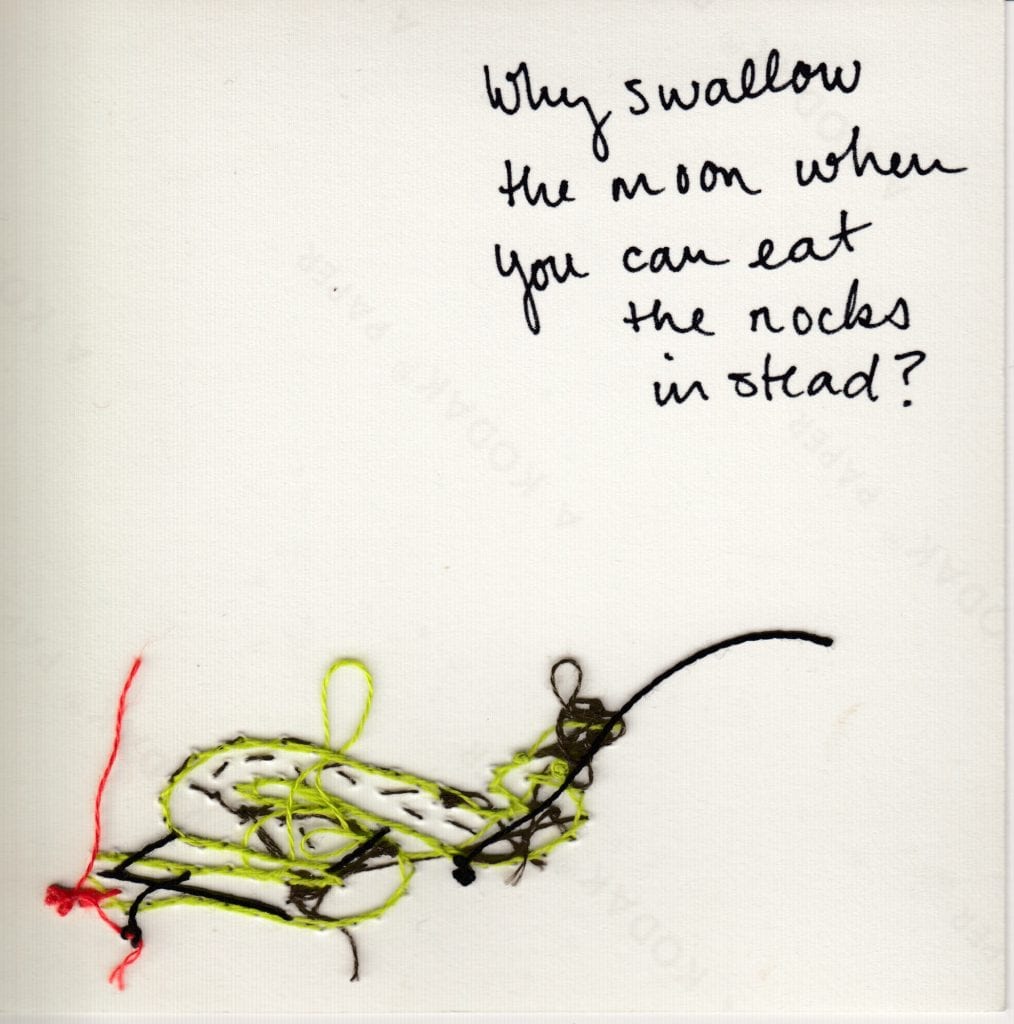
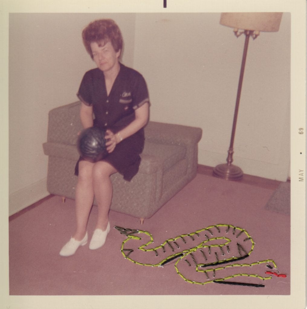
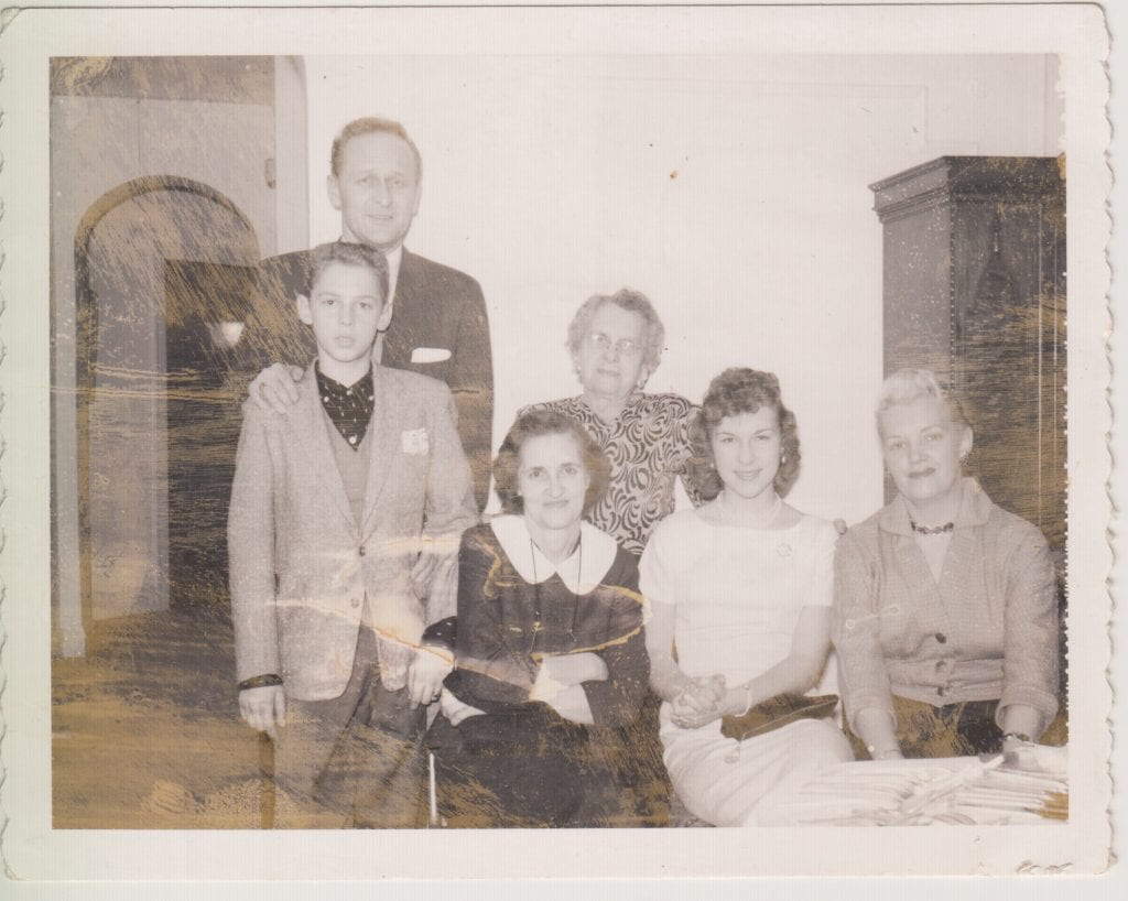
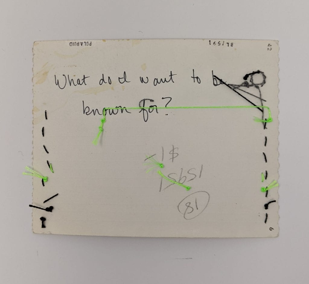
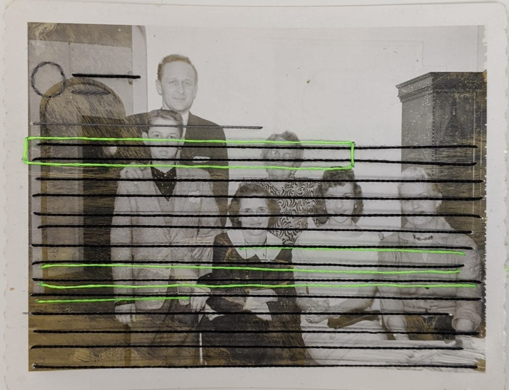
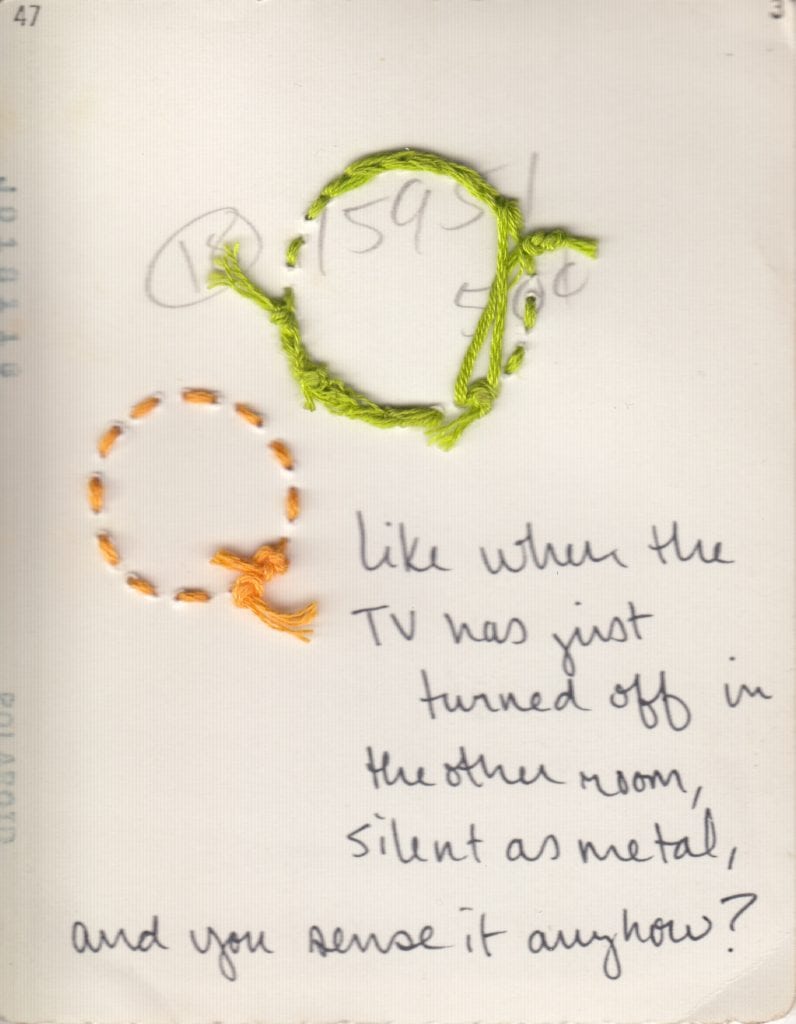
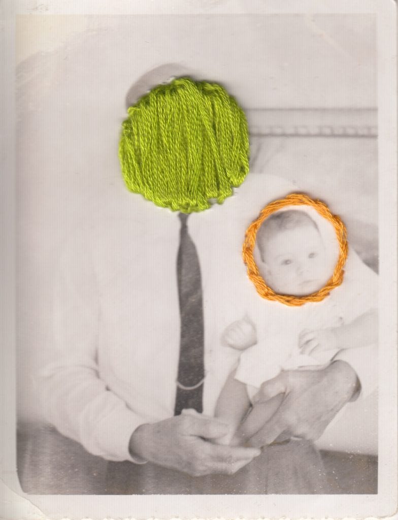
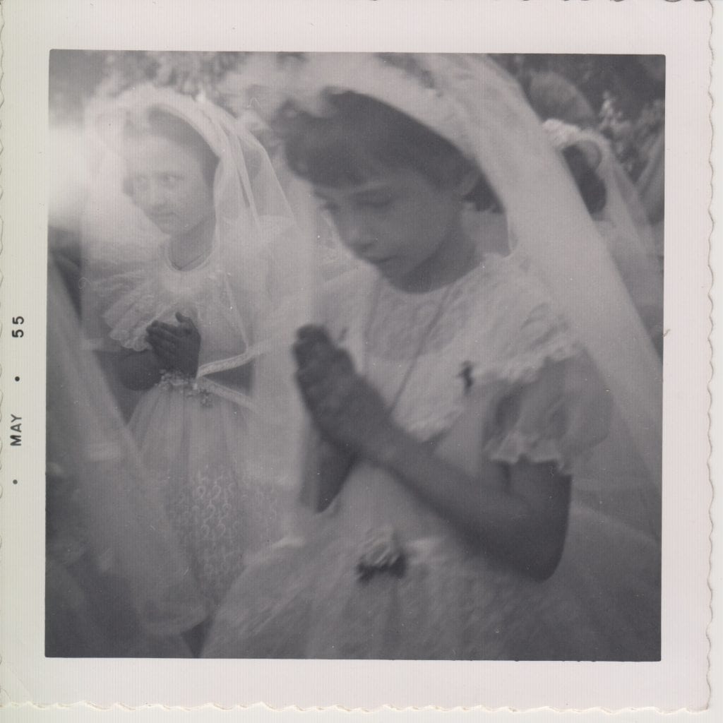
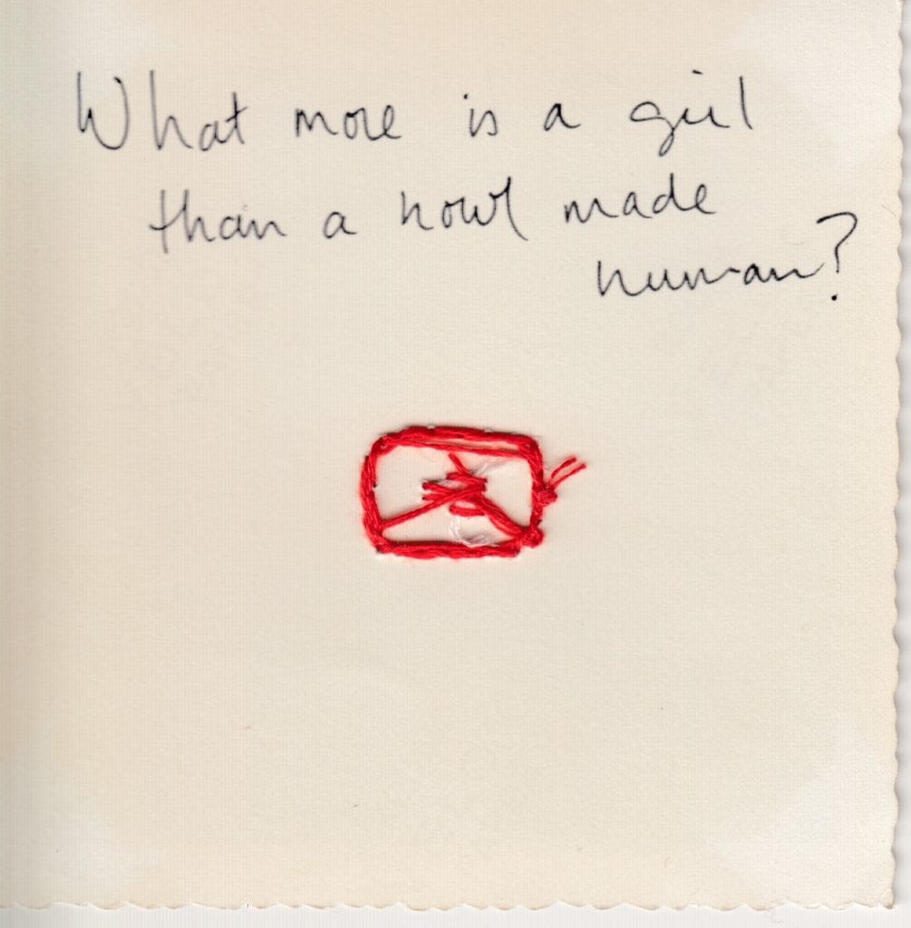
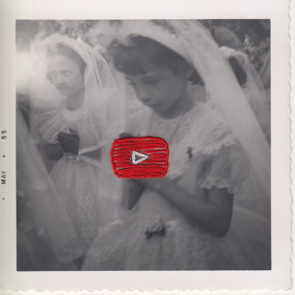
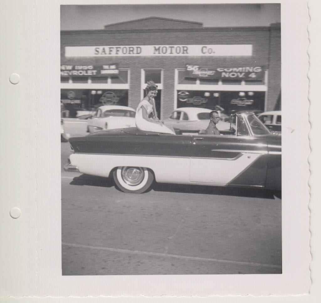
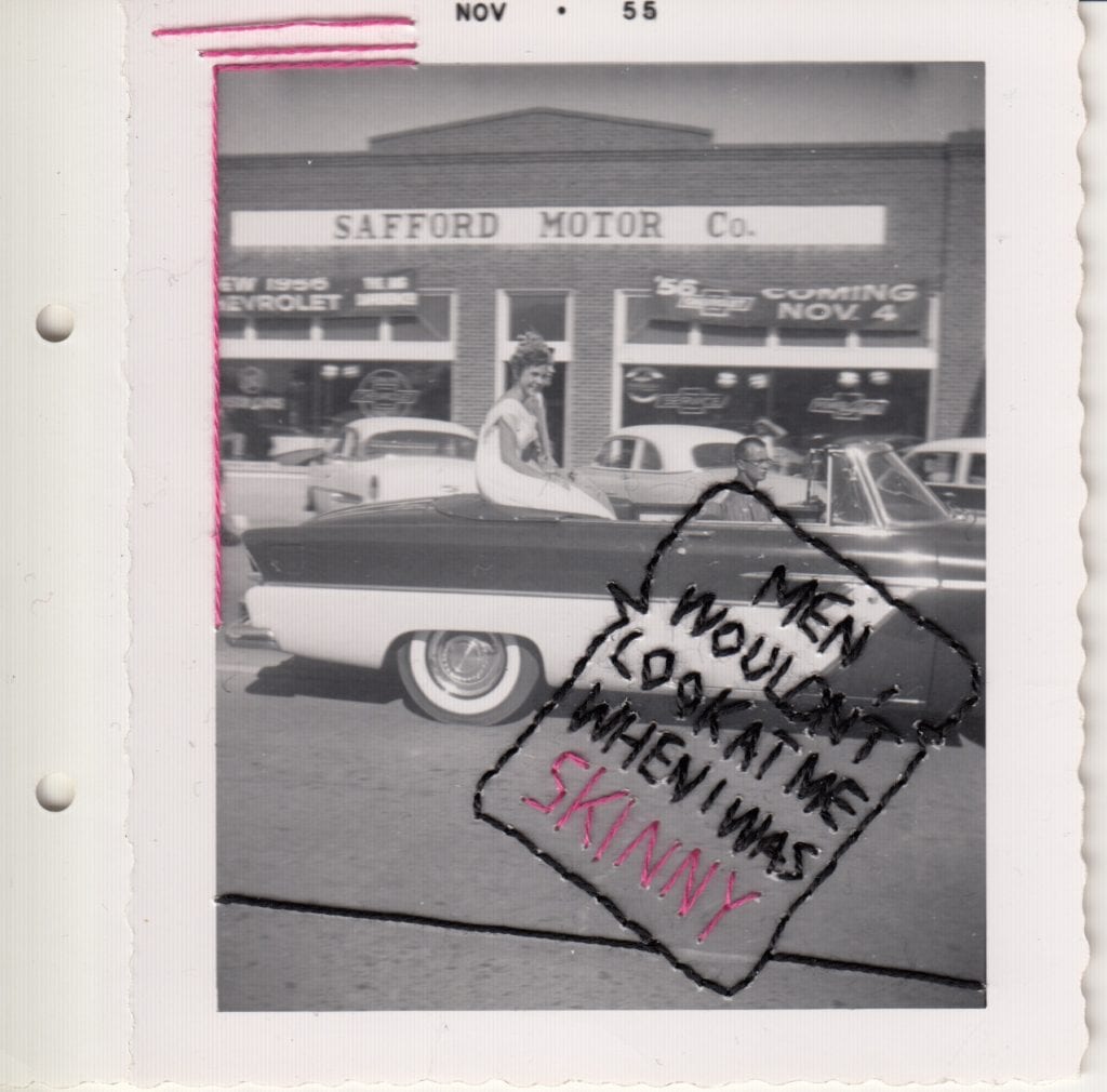
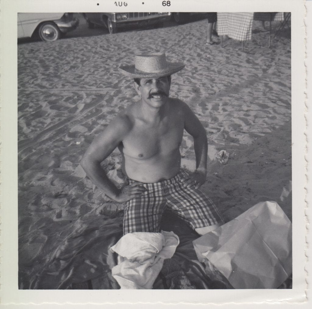
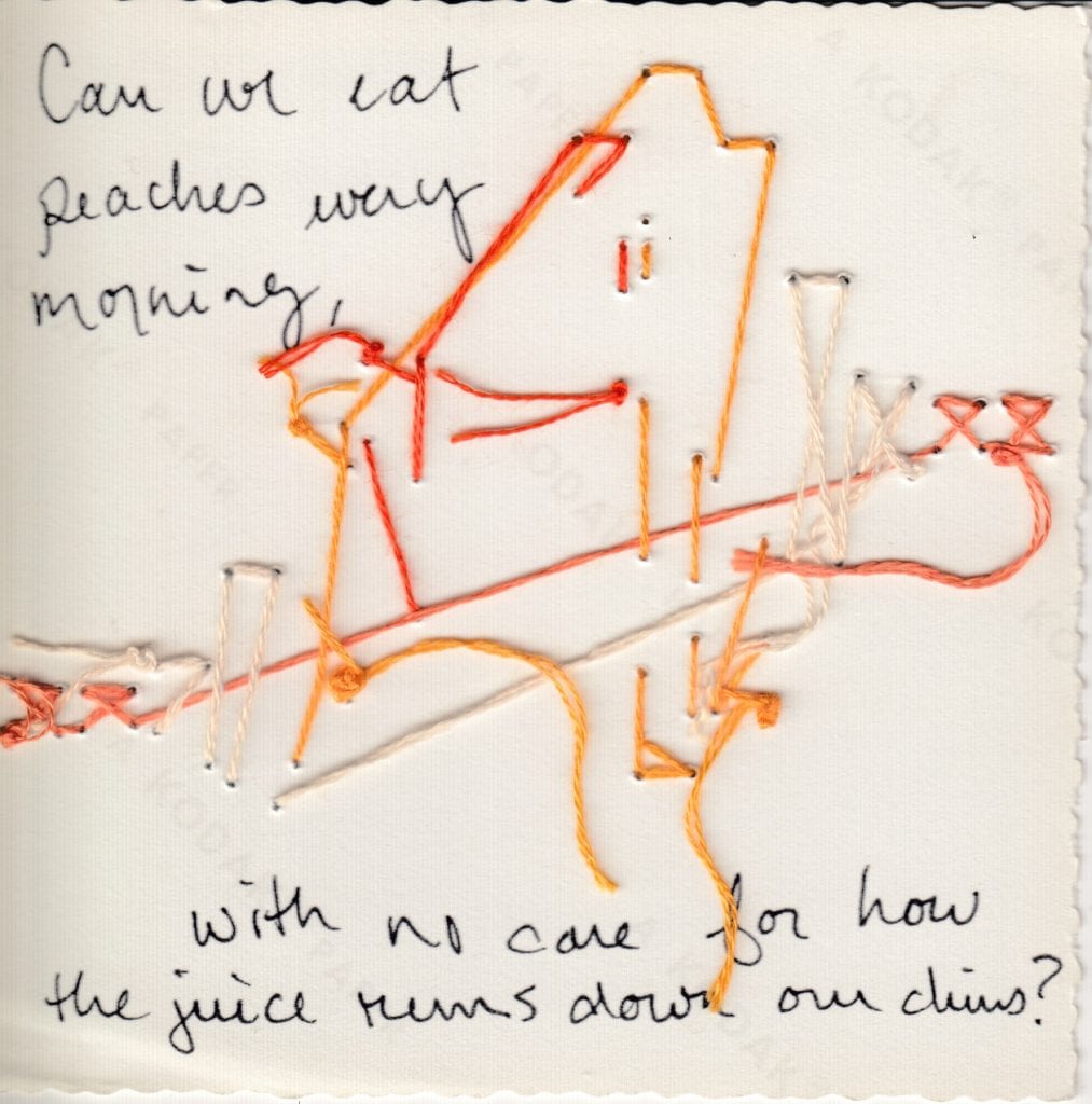
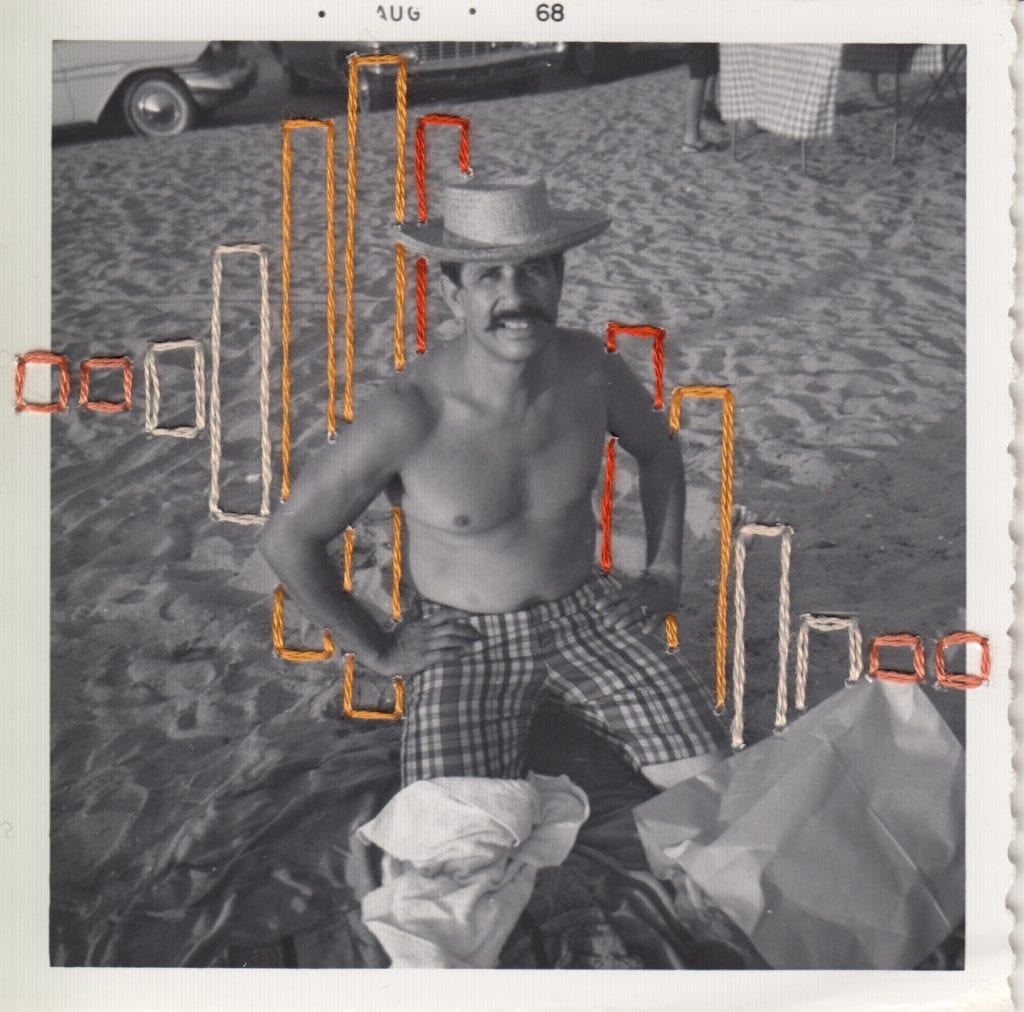
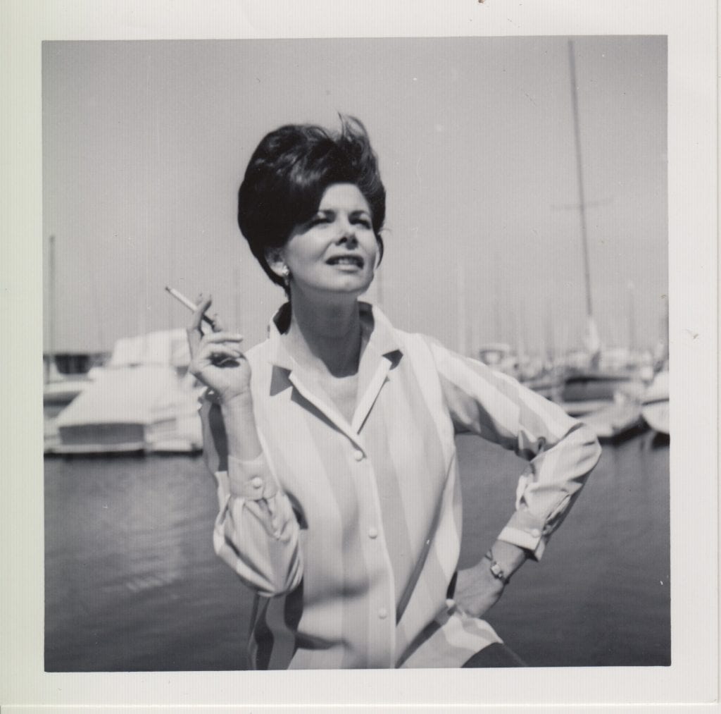
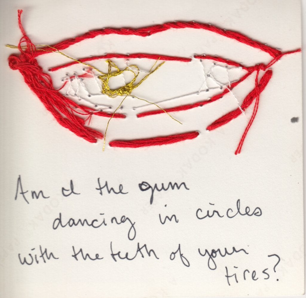
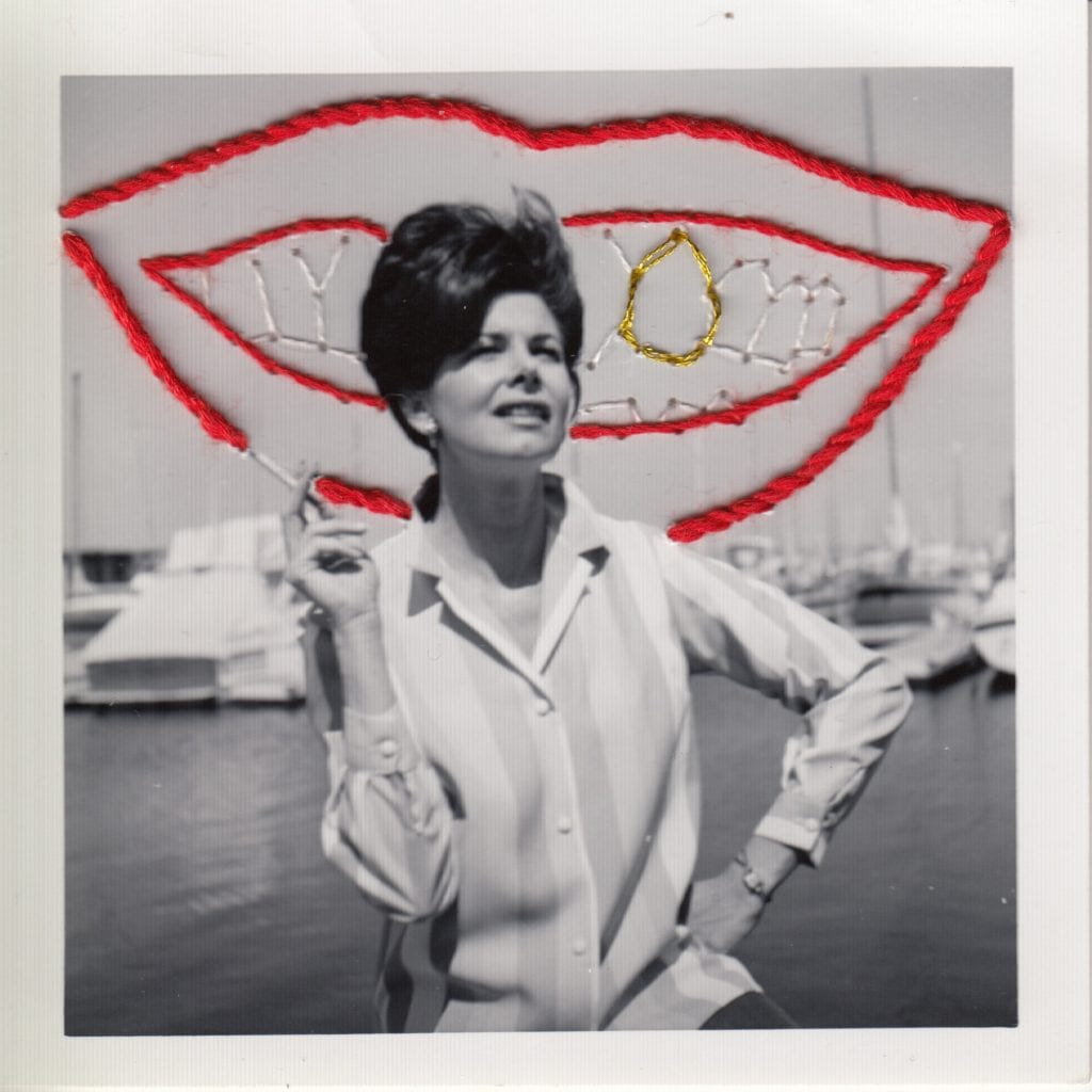
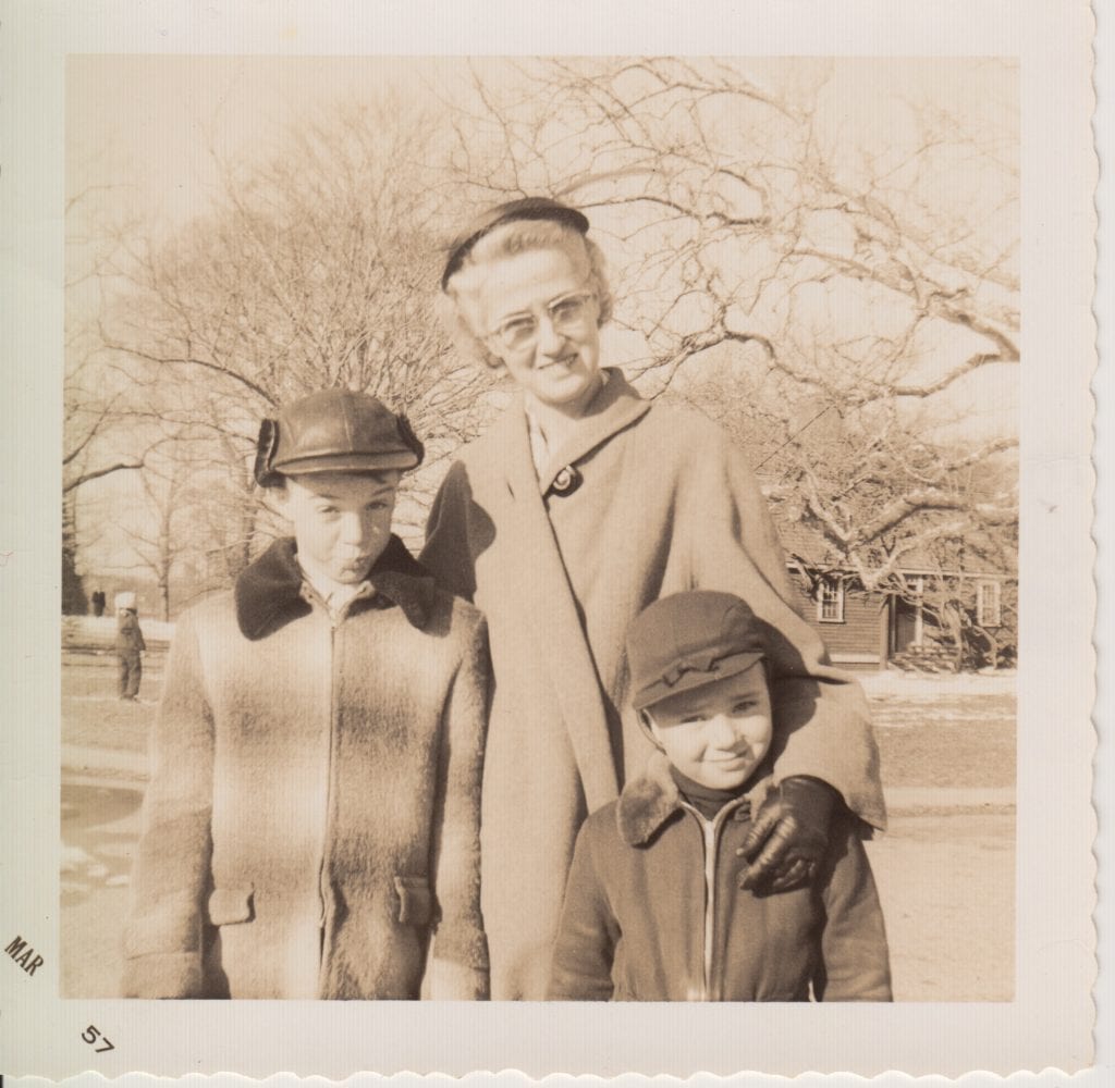
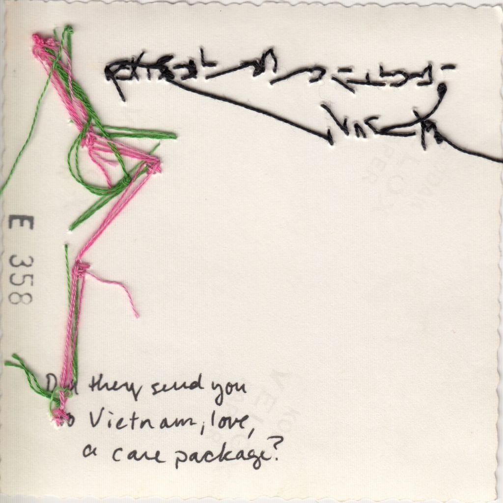
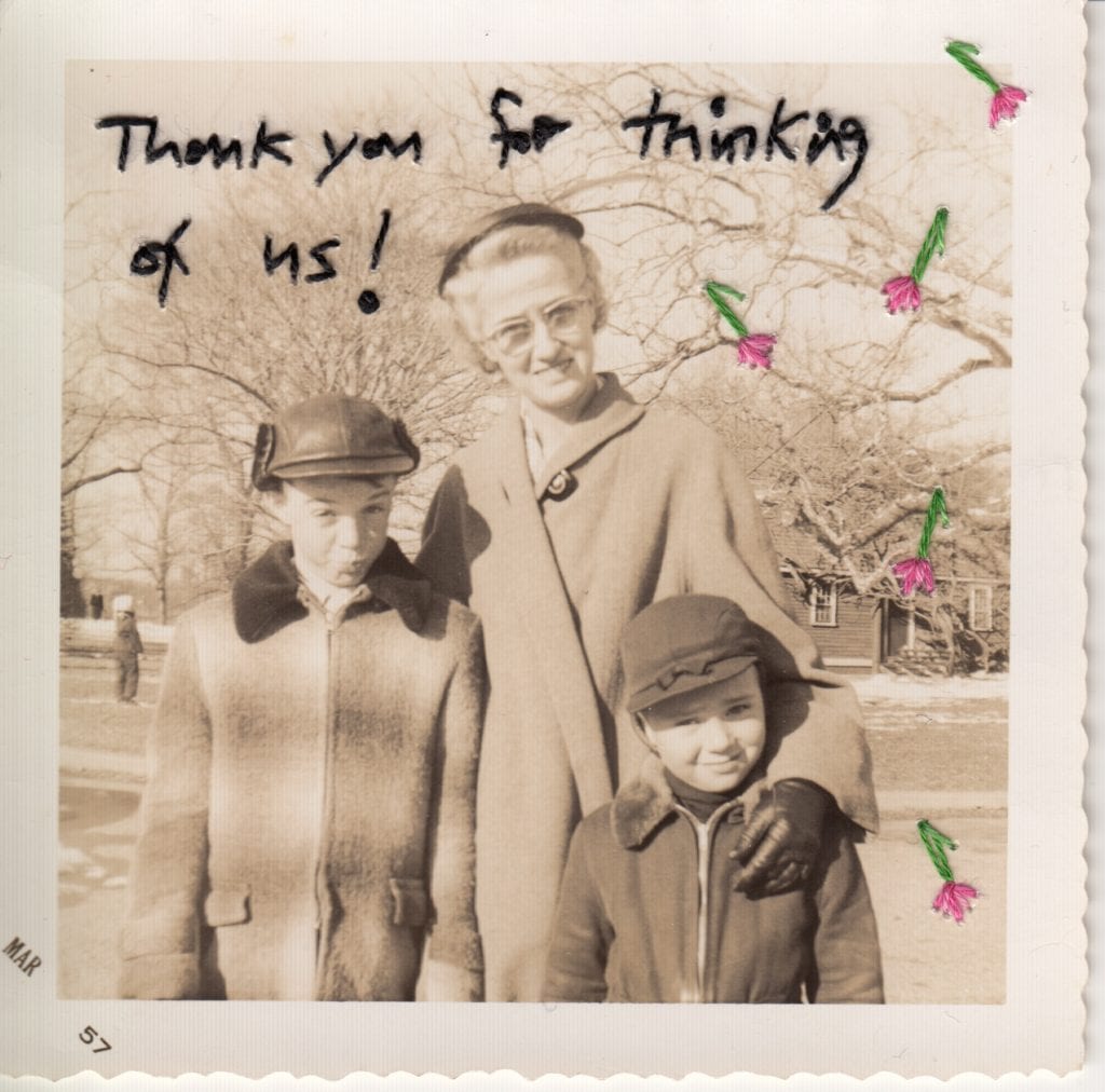
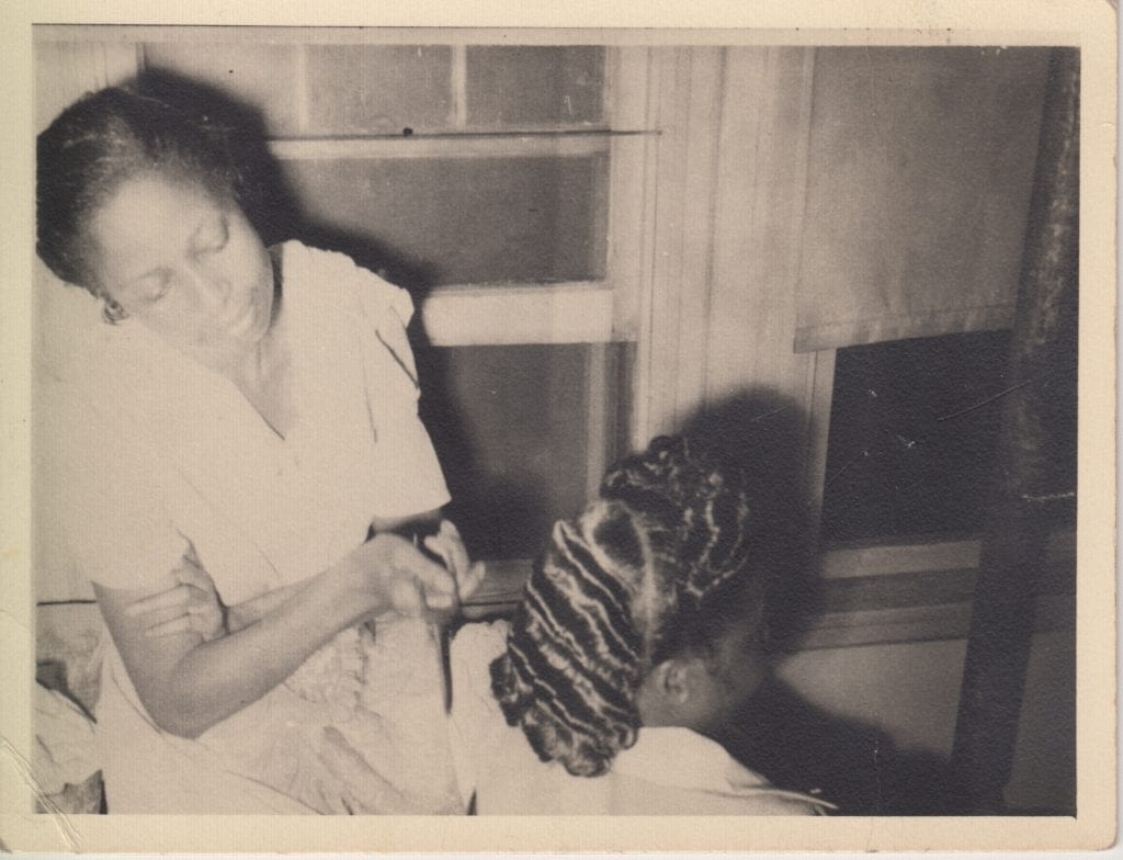
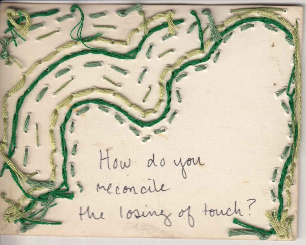
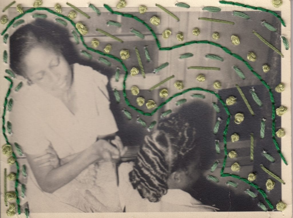
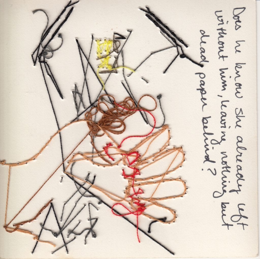
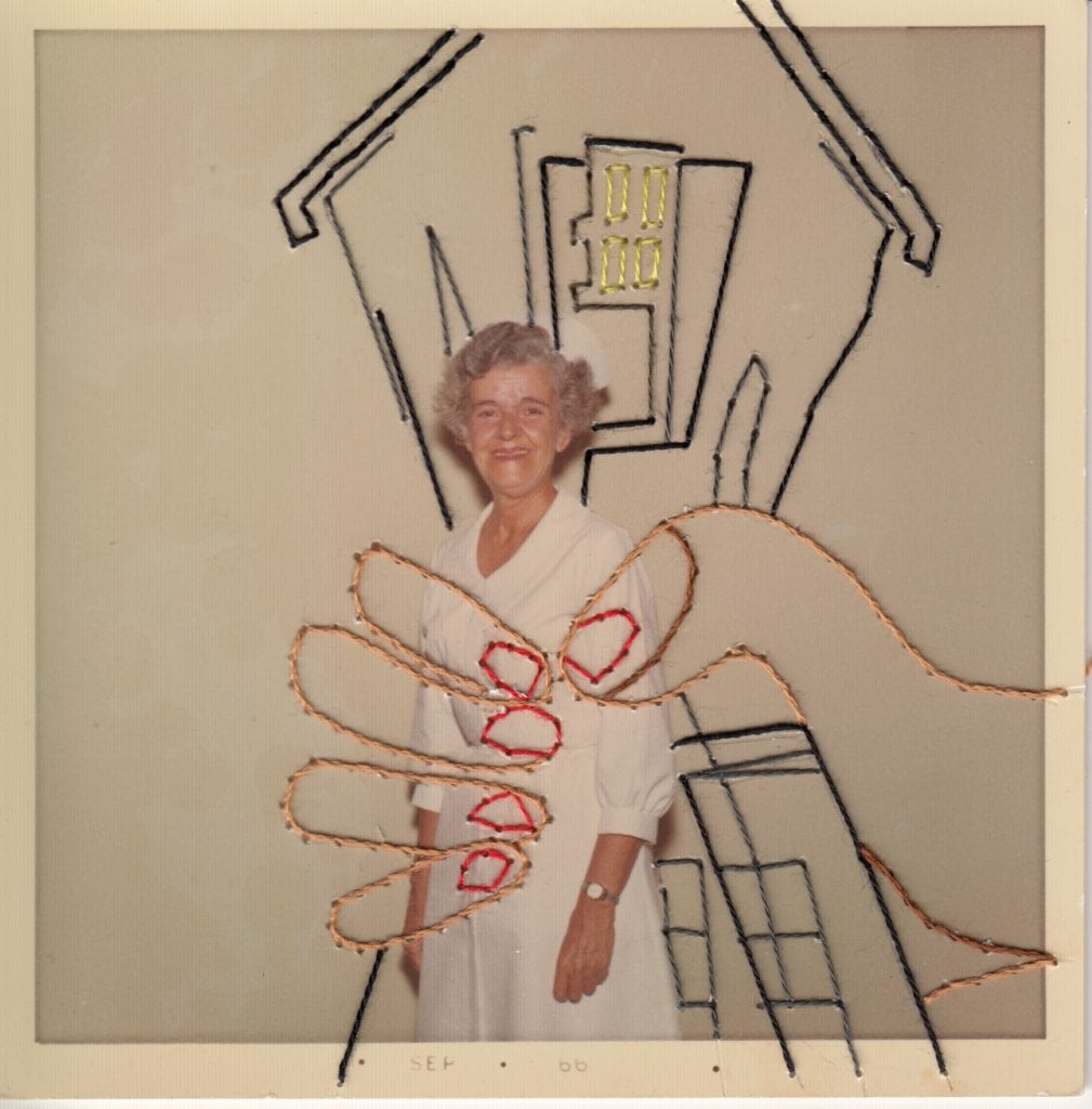
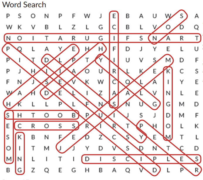
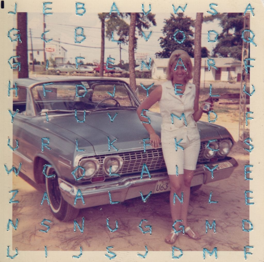
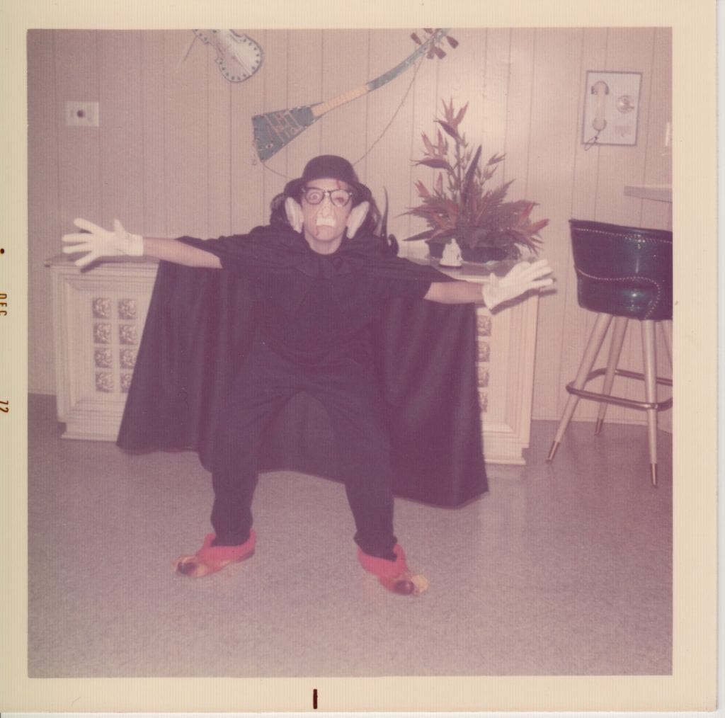
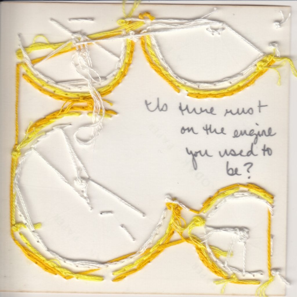
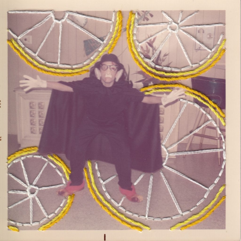
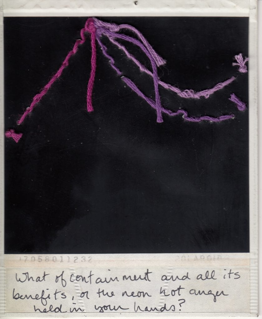
The Show Your Work series considers the human tendency to impose our own narratives on another’s truth, as well as the layered and complicated process of rewriting the present by reconsidering the past. Each image in the Show Your Work series is a previously discarded photograph dug up at an antique store or on a found-photo resale site.
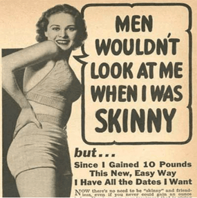
To determine what to embroider on each image, I Google-searched a question sparked by the original photograph, selected the most intriguing image that showed up in the Google results, and then embroidered that web-found image onto the original photograph.
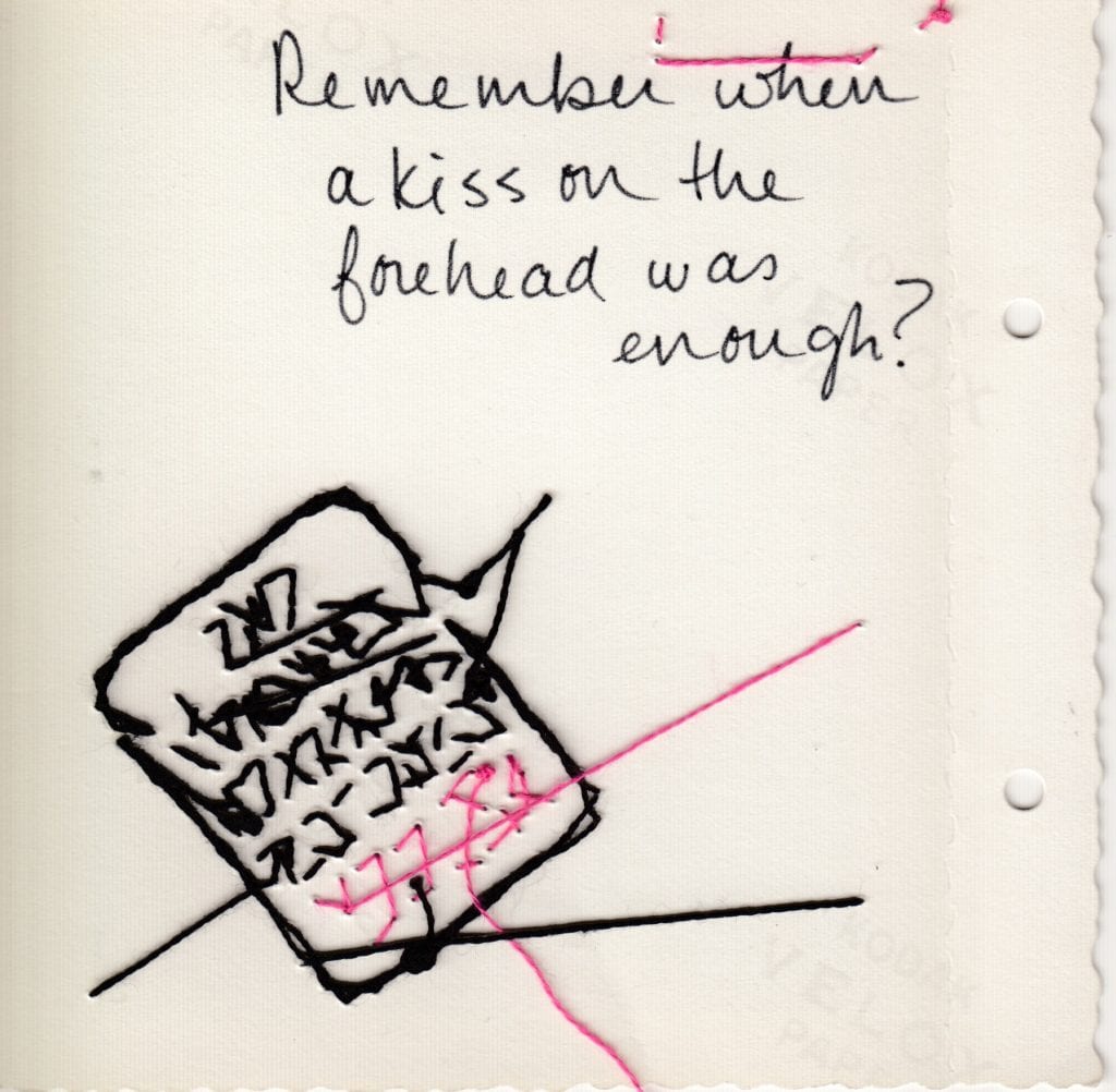
The framing methodology of double-sided glass frames encourages viewers to turn the frame around to see the back of each altered photograph—to see the work. The flip side of the photo can reveal the history of the photo, a pentimento of its years as a multi-purpose object, and hint at the many hands that have touched it. See the messy embroidery backside not often shown by artists and crafters, find the Googled question in my handwriting, and read any prior markings by previous owners of the photograph (including years, names, notes, and/or antique store sales information).
In a time that’s all about content generation, what do we do with the “content” that’s already here? This work also engages contemporary culture’s historically profound ability to divine answers almost immediately, as well as the tension and confusion that results from our very mortal inability to find the answers we are most often in search of.
This presumptuous layering work was partly inspired by photographer Cindy Sherman’s famous 1981 photograph “Untitled #93,” which, though technically not titled, she calls “The Black Sheets.” Sherman is purposefully ambiguous, leaving the viewer to make their own assumptions about the image—often vastly different from her own intent when staging the portrait. She says, “I think of that character as having just woken up from a night out on the town and she’s just gone to bed like five minutes before and the sun is waking her up and she’s got the worst hangover and she’s about to pull the sheets over her head or something and go to sleep. And other people look at that [photograph] and think she’s a rape victim.” Why do we see what we see? How does our perspective get it wrong? What does it get it right? Is there a space in between these extremes and, if so, how do we hold that space for ourselves and others?
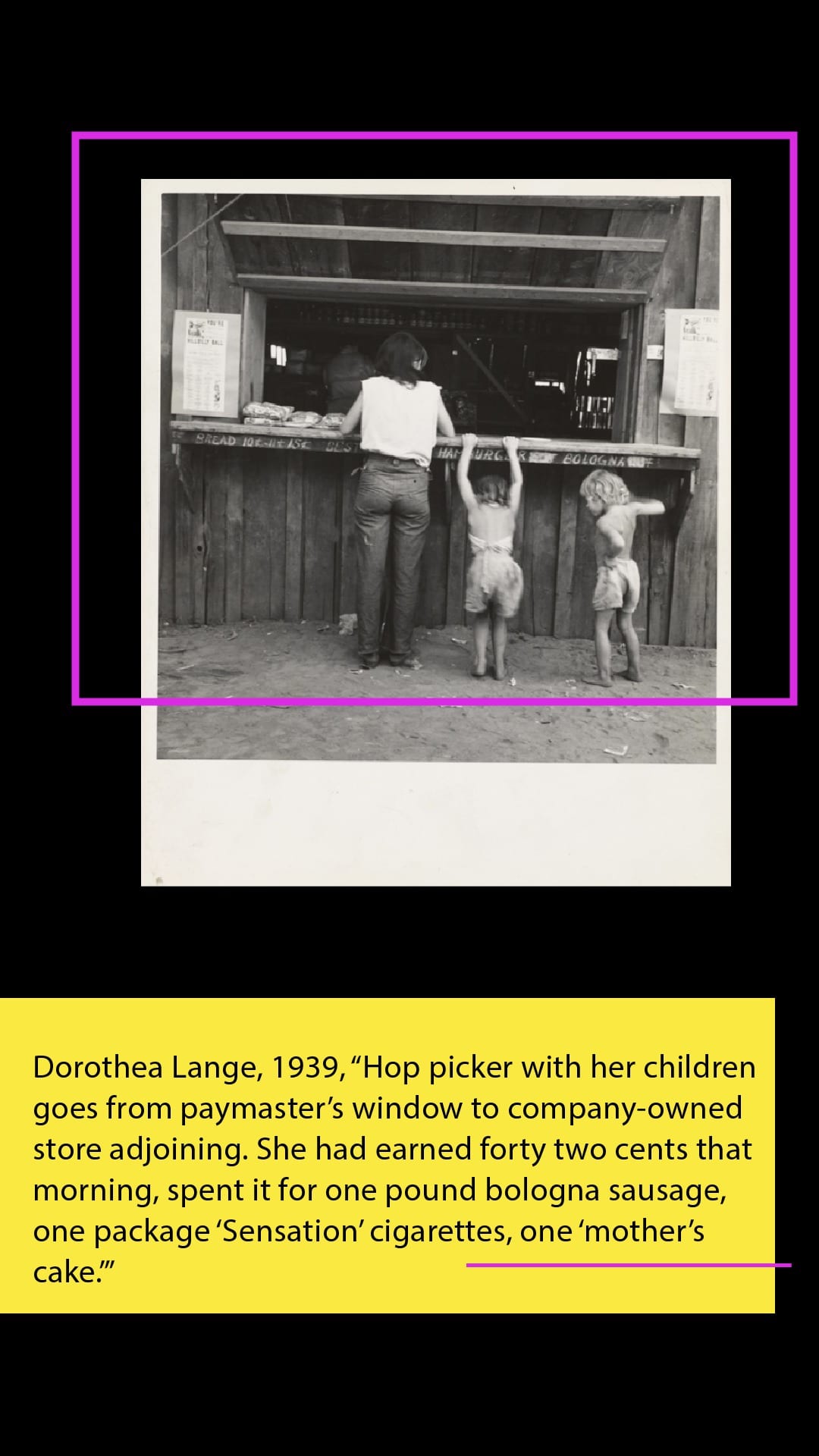
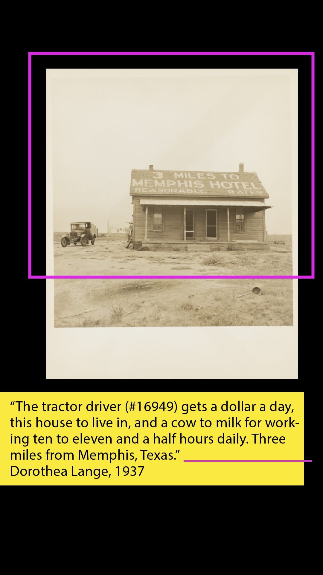
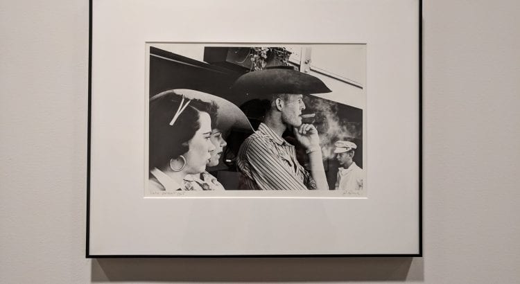
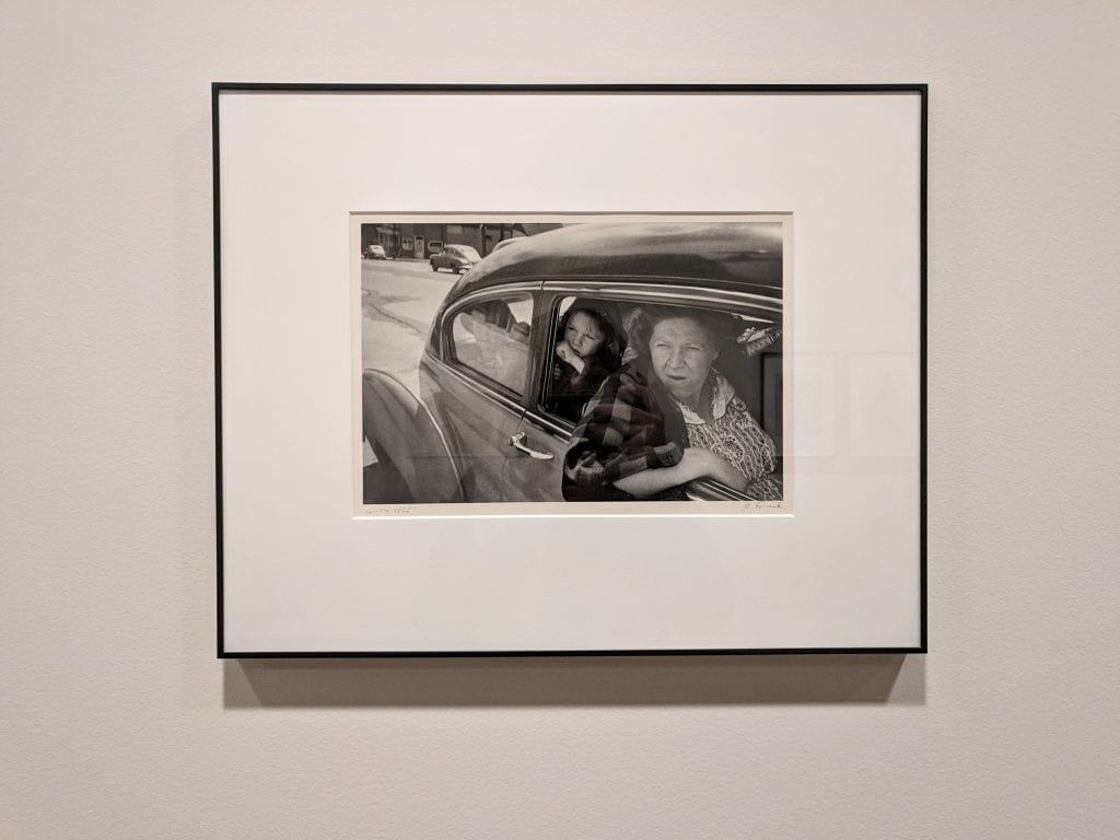
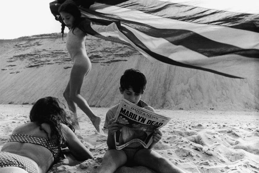
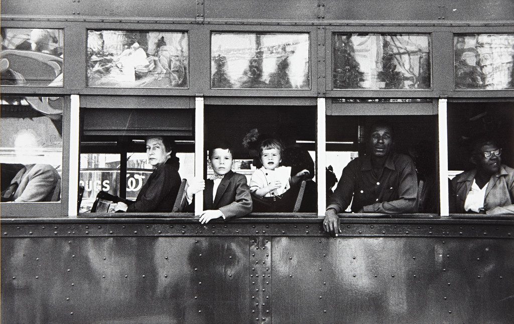
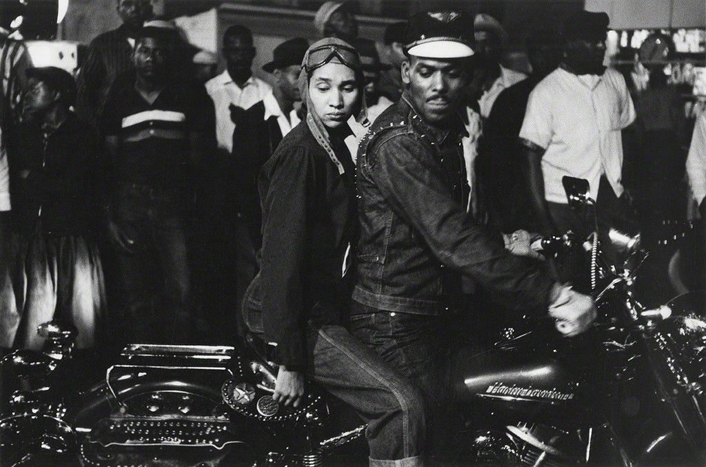
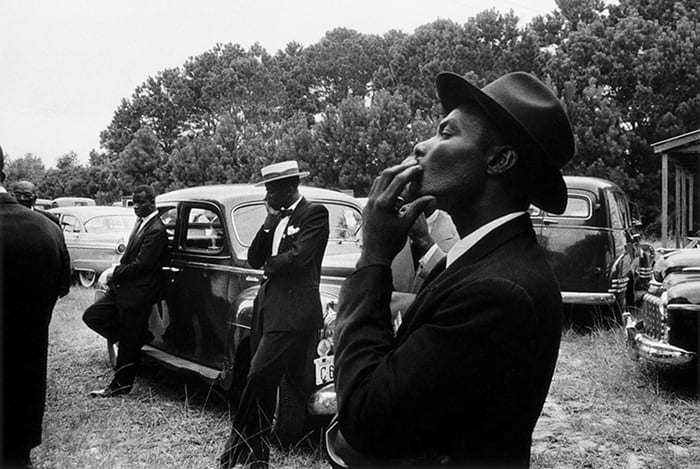
Capturing America’s inconsistencies and contrasts is practically a pastime now for the average artist. We owe a tip of our baseball hats, emblazoned in racist symbology, to those who developed this aesthetic with such originality that their historical influence is practically cliché. I’m thinking the hard-nosed, coked in empathy narratives of Dorothea Lange; the searingly lonely dream-scaping of Edward Hopper (#1 all-time fave). An artist who deserves to be part of this lineup of artists that the gen pop rattles off when considering Great American Artists Who America-ed America is Robert Frank.
Actually, Frank, a photographer, was Swiss-American, and his new-citizen status gave his work a non-sentimentality surrounding American Life. In the 1950s, this translated to an incredibly unique source of truth for what was happening behind the technicolor and catchy slogans of the post-war pop culture.
I am always looking outside, trying to say something that is true. But maybe nothing is really true. Except what’s out there. And what’s out there is constantly changing.
Robert Frank
In 1955, Frank got a fellowship from the Guggenheim Foundation. For the assignment, he spent two years traveling the States with his family and taking photographs of everyday life in places like Detroit, Savannah, Miami Beach, LA, Salt Lake City, Butte (Montana), and (of course) Chicago. In those two years he took more than 25,000 photographs and 83 of them became The Americans, a book of images that “changed the nature of photography. What it could say and how it could say it,” wrote art critic Sean O’Hagan nearly six decades after the book’s publication in 1958. The Americans, he says, “remains perhaps the most influential photography book of the 20th century.”
Frank’s imagery was subtle but impactful because grandiosity
took a backseat to themes of boredom, toil, and blind patriotism. These are
everyday Americans who live under the spell of American lore with a sort of
dumbfounded despair. (It feels achingly familiar to our social media age—ie. if
I’m supposed to be happy here, why am I so sad/mad?)
Frank’s compositions depicting race in America are particularly powerful. Prescient, even, considering hindsight of social photography and the incredible civil and human rights upheavals on the country’s horizon. This theme is, again, where Frank’s individual experiences and characteristics gave him a honed eye for making these observations about our country’s racial cruelty. As a Jewish man, he experienced profiling while photographing in the South. He was put in jail in Arkansas. Told he had an hour to leave town by a deep-South sheriff. This racism indelibly shaped his view of the country, which indelibly shaped everyone else’s view of it too. Moreover, he gave brutalized communities a chance to show their strengths, despite all they faced in 1950s America.
There are too many images, too many cameras now. We’re all being watched. It gets sillier and sillier. As if all action is meaningful. Nothing is really all that special. It’s just life. If all moments are recorded, then nothing is beautiful and maybe photography isn’t an art anymore. Maybe it never was.